It’s been a long while since I did a tutorial post (though I’ve got lots of stuff to talk about, I simply haven’t had the time to work on something). But today is a day on which I’d like to take you behind the scenes of one of my pages – the thoughts, the processes, what helped me put this page together.
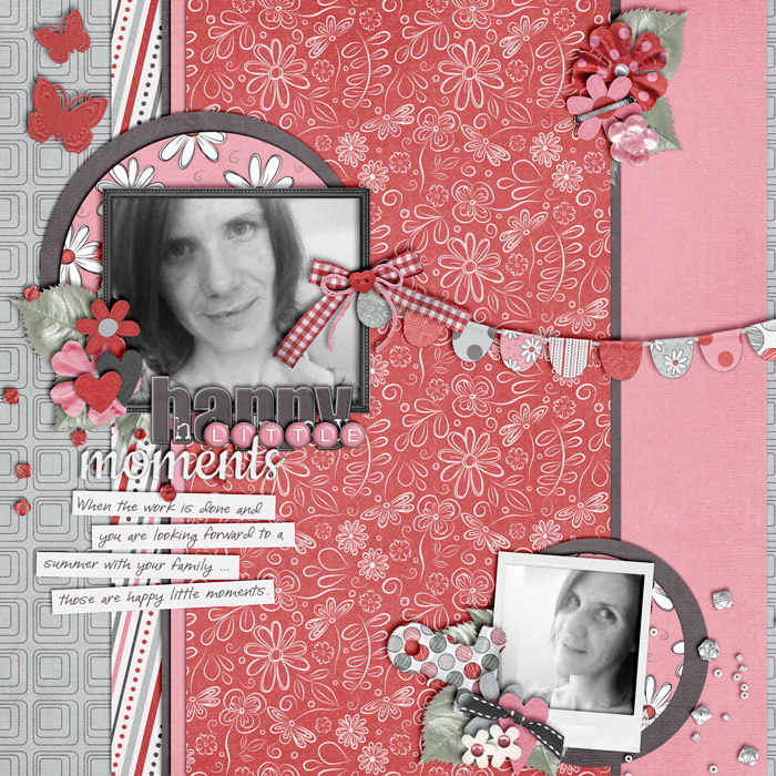
Take a look at the layout “Happy Little Moments” created with the kit “Super Mom” by Heather Roselli (Sweetshoppe Designs):
In this post you will learn about:
- Mats – how to use them for contrast between patterned pages;
- The Visual Triangle – how to create a visual flow in your composition;
- Journal Strips – to set off your journaling.
The kit comes with lots of gorgeously patterned papers, and I really wanted to use some of those patterns on my page. The problem with patterned papers is that they can quickly make a page come across too busy, or photos, elements and journaling might get lost in the mix of all the patterns. I didn’t want that to happen, but I also wanted to give some of those patterned papers some room to play. The solutions was mats.
Using Mats
I used mats to contrast the busy patterns. I placed solid colored mats (brown and pink) between layers of patterned papers, and they created a break between the patterns which doesn’t make everything look too busy and confusing.
Also, note the pink large mat to the right side of the page. At first, I only had the pink appear slightly from underneath the brown, but decided that my page would look too regular for this – just a typical symmetrical composition, of which I have so many in my scrap stash already. That’s when I had the idea of shifting the pink paper further right so that it nearly covered the entire right side of the layout. It sort of brought a nice balance to the rather busy left side of the page.
Visual Triangle
Then I needed to decide where and how to place my element (clusters), photos, title, and journaling. I wanted to do that with a visual triangle in mind, an important concept in graphic design through which the eye is guided over a page and finds places of visual interest that capture attention. So I basically created three clusters of various sizes – one main one that contains the main photo, the title, journaling, and some embellishments; one to the bottom right that also contained a (smaller) photo and some embellies, and one toward the top right of the page. I tucked the leaves underneath the red patterned paper so that they would only show on one side of the cluster, and stapled the little flower to the page.
Journal Strips
Then came the journaling. Originally, I had thought I’d be able to put my journaling on the border of solid pink to the right but quickly realized that this would totally change the dynamics of my page (visual triangle). Instead, I chose to combine it with the main cluster on the left side. But how do you make your journaling visible on a very busy patterned background? Journal strips was the answer. I placed all my writing on journal strips, and voila: everything looks quite orderly (though not too orderly – I angled the strips a bit to loosen things up a bit), and the eye can leisurely wander from cluster to cluster without ever feeling too overwhelmed at all the patterns and embellies I used.