All posts tagged: tutorial

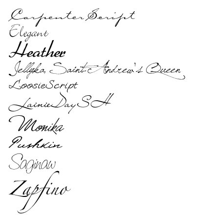
Behind the Scenes: Some “Scripty” Fonts

I admit it flat-out. I’ve been a font-lover for it seems like forever. I’ve loved fonts and accumulated them on my computer long before I ever even heard of digital scrapbooking or knew anything like that existed. Now that I’ve been on Darcy Baldwin’s CT (she’s a fontographer at Sweetshopppe – for those who don’t know her) the number of font files on my computer seem to explode (and yep, I’ve heard the rumors that this slows down your computer, so eventually I’ll have to start downsizing my font database). Anyways, the point I’m trying to make: I love me some fonts. So, I thought today, for an easy start, I’d share another couple of my favorite fonts with you. This time I’ve gathered some of my more script-style fonts, and here they are: These are the ones I go to first, before even looking at some of the other fonts on my computer (when I’m looking for something scripty). In any case, they are available for free at the usual font downloading places (dafont, …

Behind the Scenes: Using Paper Piecing Patterns in Photoshop

The other day I promised you I would do a tutorial about how to actually use paper piecing patterns such as scrapbooksetc.com offer for free on their website. And today is the day! Like many other resources on the internet, these paper piecing patterns come in .pdf files, which is great when you only want to use them to trace the shapes on an actual piece of cardstock. But how do you go about when you want to use them with a graphic program such as Photoshop? The answer is really simple, and there are different ways how you can actually utilize pdf paper piecing patterns, create clipping masks, or resize these patterns to better meet your needs. Access Patterns in Photoshop The first thing you have to do when working with pdf files, is make sure, you can access the file with photoshop. Some files easily allow that: Simply right click on the file in your folder, and choose the option “Open with …,” and then pick “Photoshop” in the fly-out menu. This will …

Behind the Scenes: It’s All Black & White

Today, I’d like to share a little  about black & white photography. Monochrome photos are timeless. They add emotion and drama to a picture, and sometimes an otherwise rather boring photo can gain momentum and become quite capturing when turned into a black & white image. Almost any scene can be turned into a black & white image, though when working with these kinds of photos, it’s good to know a few things about black & white photography to enhance the quality of your pictures significantly. Contrast Without color, the various shades of gray in black & white photography become rather prominent. Therefore, it becomes very important to make the subject of your photo stand out from the rest of the photo. A light subject against a dark background, for example, will accomplish that, but including various shades of gray also can make a big difference, since they will add depth to your photo. Shape & Form Without color to guide and lead you through the photograph, shape and form become very important aspects of your …

Behind the Scenes: It’s On My List

Admitted – I love lists! My desk is strewn with them. Always! At the moment, I have about seven lists of various shapes and sizes cluttering my desk, in addition to all the other little notes and reminders I keep collecting. I have book lists (work/study related), lists with activities/games I’m planning to do with my students at some point, lists for grading, lists with scrapbook titles and page topics; there is even one list of my last sweet rewards purchase at the Sweetshoppe (I think I can discard that one now!), and the “list” goes on and on. Then there is my calender/notebook/timer that is brimming with lists. Now, if you want to know the content of my lists in my notebook, I won’t even go there, because then there’d be no end to this post! Basically, anything from future scrapbook projects (sorted by topic/year/event), to title ideas, to topics for blog posts, to interesting quotes I find, to … you name it. It’s there! Yes, I’m a list lover, and that must reflect …

Behind the Scenes: Principles of Design – Rule of Odds

I have another principle of design that I’d like to discuss with you today, because it is a concept that will be very useful to keep in mind when you are working on a scrapbook page. It’s the Rule of Odds. Basically, this rule says that it is better to work with odd numbers than with even numbers whenever you work on a composition of any kind. Whether you take photos, create a painting, or – like us – design a scrapbook page – knowing about the Rule of Odds can improve your composition significantly. In other words, to ensure that your page turns out more dynamic, work with groups of three, five, or seven, instead of two, four, or six. Naturally, what happens with the human eye or brain is that they try to pair things up or group them together. This may be, because in nature we often find pairs. Even our body is designed in pairs: two eyes, two ears, two legs, two arms and hands, … you get the point! So, …

Behind the Scenes: Creating a Digital Design Tray

It’s time for our monthly Photoshop tutorial, and I thought, today I’d like to take you to the world of Bevel & Embossing. In other words, I’m going to show how you can create a design tray similar to the one I did just the other day. SSD has a challenge this month, for which they used a really cute design tray as inspiration, and I loved the image so much, that I wanted to try my hands on this kind of design. The problem: I don’t have any such design tray – neither in my digiscrap stash, nor a physical one at home. But I had an idea of how I could achieve a somewhat similar look digitally, and here is what I did: 1. Create a blocked background I started by creating a blocked background with the Rectangle Tool on my blank canvas. After filling the whole canvas with blocks of various sizes, I selected all the layers in the Layers Panel, and duplicated everything. The duplicated layers I merged into one layer; …

Behind the Scenes: Smart Sharpen Your Photos

It’s time for our monthly photography “class,” and today I thought, I’d stay rather simple. There are many tiny and very easy steps to improve our digital photos, though they can have a great impact on our images. One of these small, but effective tools in Photoshop is the “Smart Sharpen” filter. If you are anything like me, you already know about the process of saving your layouts for web, and that using the “Unsharp Mask” filter is part of that process. When working with photos, however, I discovered that the “Smart Sharpen” filter comes in very handy. With just a few clicks, you can improve the image significantly, and that can also make a difference on your digiscrap layout. Take this photo for example: I took this picture last weekend, and I didn’t make any adjustments. It’s a pleasant photo, but the edges of the little petals are a little blurry. Now take a look at the same image, after I applied the “Smart Sharpen” filter: I didn’t do anything else to this image. …

Behind the Scenes: What About Tracking & Kerning?

Have you ever heard about tracking and kerning? If not, today you will, for it is “Time for Type!” Yes, you got it right: today, we are talking about fonts again. Fonts and journaling. If you know anything about typography (or graphic design for that matter), you might have heard about tracking and kerning already. For those of you who are clueless, however, let me explain … Tracking – according to one of the many photoshop tutorials – is “the process of loosening or tightening the spacing between characters” in a text. Kerning is “the process of adding or subtracting space between specific pairs of characters.” If you go “Ah???” now, hold on! I’m still not done explaining. Tracking Basically, when we talk about tracking, it means to add or take away space between the characters of your text. It applies to the whole text and can make your text look wider or more dense. Condensed text will appear heavy, while loosened text will appear lighter.   Kerning Kerning, on the other hand, deals with …

Behind the Scenes: Ideas for Photos in Spring

Many of us love to take photos. It’s part of our memory keeping process. The problem starts, when you are tired of the same ol’ same ol’ kind of photos that you get every year – the ones where the only difference is, that it’s a different year, and the faces get older. If you are looking for some fresh ideas and inspiration for your spring photos, however, I might have just what you are looking for. I did some researching the last couple of days to come up with ideas to make your photos a little more fun and varied. And for your convenience I’m putting them together in a nice little list. Spring Cleaning What’s part of your spring cleaning? Your progress Before and after shots You accomplishments Spring – Season of Firsts First flowers in your garden First warm day First picnic First time playing in the park First bbq First time swimming Easter Your decoration this year Your decorating progress Egg dying Easter baskets Egg hunts Your Easter treats this year …

Enable Me: Snaggle’s Shadow Spectacular

Wednesday’s here, and that means it’s time to hook you up with another great internet resource. Since I’ve done a lot of photoshop actions recently (and I still have several more to come, so stay posted, if you don’t want to miss out on them), I thought, I’d enable you with another tutorial on how to create great shadows. In a thread over at scrapmatters.com, Carly (user “snaggle7575”) shared some insight into her process of shadowing a couple months ago. She gives us the exact specifications for how she does her shadows, and if you are still trying to find the best way how to shadow your digi-scrap elements and papers, then Snaggle’s Shadow Spectacular could be a very helpful tool for you. You can check out her post HERE or simply click on the image above. BTW, Paislee Press is giving away spot to an online scrapbooking class “Sketchbook 3.” If you haven’t heard about this, yet, you should check it out HERE.