All posts tagged: tutorial

Behind the Page: Happy Little Moments

It’s been a long while since I did a tutorial post (though I’ve got lots of stuff to talk about, I simply haven’t had the time to work on something). But today is a day on which I’d like to take you behind the scenes of one of my pages – the thoughts, the processes, what helped me put this page together.   Take a look at the layout “Happy Little Moments” created with the kit “Super Mom” by Heather Roselli (Sweetshoppe Designs):     In this post you will learn about: Mats – how to use them for contrast between patterned pages; The Visual Triangle – how to create a visual flow in your composition; Journal Strips – to set off your journaling.   The kit comes with lots of gorgeously patterned papers, and I really wanted to use some of those patterns on my page. The problem with patterned papers is that they can quickly make a page come across too busy, or photos, elements and journaling might get lost in the mix …

scrapbook layout, outdoor, weather

Behind the Scenes: Scrapping with Themed Kits

Themed kits are great for scrapping a very specific topic. I have lots of themed kits in my scrap stash, ranging from sports and outdoors type topics to seasonal, games, hobbies, male/female, and whatever other topic you may think of. And of course, they are perfect to scrap on that very particular topic. But themed kits are useful for a lot more than that. Being part of the creative teams of quite a couple of designers, I frequently run into the problem that my designers whip up gorgeous products for which I have absolutely no photo to match, and while I could just opt for scrapping a photoless layout, I can just as well choose to ignore the fact that the kit is themed and use any photo I like to scrap a page that has nothing to do with the theme of the kit.   Tips to Help You Scrap Non-Themed Layouts with Themed Products Stay generic Only use those papers and elements that are just about included in every typical kit, esp. embellishments …

Enable Me: Stitch Up Your Layout

Are you one of those people who always likes to improve their digital scrapbooking skills, or likes to learn new things about Photoshop? Well, then I have something for you today. I came across a fun little tutorial on another website, that gives real simple instructions on how to create a stitching effect (for website design), but of course, we can use it just as well on our scrapbooking layouts. This BLOGPOST comes with a little download that will get you hooked up on your stitches real fast. It’s for beginners, and if you’re curious enough, you might want to check it out HERE.

scrapbook layout

Behind the Scenes: The Evolution of a Digital Scrapbooker

Tons of people dream of getting a spot on various CTs for their favorite designers. Some people’s dreams come true, others still wait for them to be discovered. If you’re someone whose just started out on digital scrapbooking recently, I may offer you a piece of advice: be patient. Developing your scrapbooking skills takes time. It also takes determination and a desire to do the job well. There are various skills a digital scrapbooker needs to develop in order to make a page interesting and looking well. If you desire to improve your scrapbooking skills, don’t neglect those areas: Composition It’s a major part of a scrapbooking page. If you just scatter things randomly on a page, chances are that it probably will look like that: a simple scattering of elements and stuff. Nothing to draw the eye. Anyone involved with art, however, will know that our eyes wander, and by the way we position things on our page, we can give our eyes direction, and make them wander on purpose – there’s a flow. …

scrapbook layout

Behind the Scenes: A Case for Digital Scrapbooking

I’m sure it hasn’t gone unnoticed: I love digiscrapping. I love the creative outlet it gives me to play with beautiful papers (one of my oldest passions), messing around with colors and art, and on top of that to combine it with another one of my passions – photography – while at the same time being able to preserve memories and keeping a track of what’s going on in my life.   I love all of that! But what’s best about it: I never have to worry about the creative mess that comes with actual art projects. There’s no real cleaning up to do afterward, and yet, the results can be stunning, and they can bring joy to others. Another biggie that kind of got me hooked to the digital side of scrapbooking, is the fact that you get to scratch things and start all over again, without losing anything but the time you’ve invested. I remember well, when – in the past – I got myself a nice stack of pretty scrapbooking papers (the …

scrapbook layout

Behind the Scenes: 4+ Ways of Scrapping Double Page Spreads

When it comes to scrapping pages for photo albums and such, my preferred way of scrapping the memories is by using double page spreads. Of course, as with everything you do in scrapping, there are lots of choices as to how to go about your designs. When working with double page spreads, I’ve found there are four ways of how you can scrap them: One combined layout, using a composition that includes your entire spread. A two-page layout, using the same products. Using two pages with different products to scrap about the same topic. Two single page layouts with different products and different topics.   Option 1 | A Combined Layout This option means you would create a two-page spread like a single unit. Personally, it is my preferred choice to scrap two page spreads for an album, because it makes the two pages look like one large layout.     Option 2 | Two-page Layout with Same Product Another favorite option of mine is to create two separate layouts for a double page, but …

scrapbook layout

Behind the Scenes: 6 Ways of Re-using Templates

I love drawing inspiration from templates. See, the good thing about templates is that they are so versatile. You don’t have to work with a template just once and then it’s kind of an old shoe. It’s not. Working on the creative team of a template designer (Cindy Schneider), I’m always amazed to see all the different ways my other team colleagues are using the same templates. The sky is the limit. So, in other words I’m saying: use your templates more than once to take full advantage of them.   6 Ways of Re-using Templates Option #1 | Flipping & Rotating Obviously, the easiest way to re-use a template is by flipping or rotating it. When you do that, you’ll be amazed at how differently the page will look, and unless someone studies the two layouts in question very hard, no one will be able to tell that you’ve used the same template twice.   [border ]   Option #2 | Using Different Kits, Topics, Events Another way of making sure no one realizes …

Behind the Scenes: 5 Tricks & Tools I Use Most Often

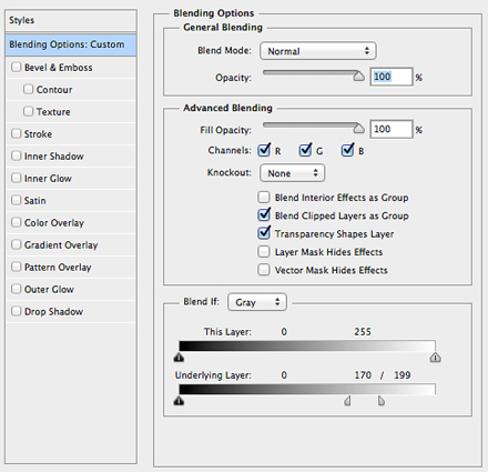
Today, I’m going to take you once more behind the scenes of my own processes of scrapbooking. I thought, it would be a good idea to show you some of the tricks, tools, and techniques I use on almost every layout of mine.   1. Alignment There is no page, on which I don’t use the alignment tool. Most often, I use it to align alphas, and to position my clusters on the page (if I want to make sure something is centered or spread out evenly). There are two ways to align things on a layout: Align within a selection (Marquee Tool or Magic Wand) Align in relation to other elements (select all layers you want aligned and align to each other, or spread out evenly)   Aligning the alpha [border ]   2. Blending & Opacity I love making things look realistic on a page. One way to make your journaling (fonts) and brushes look as if they were really placed on your paper (as opposed to floating) is by adjusting blending modes …

Behind the Scenes: Scrap Magazine Style

Who says you can only scrap the traditional way (if there is such a thing as “traditional” in digital scrapbooking)? Or with the trend of art journaling lately, pages tend to get all artsy and messy. Today, however, I would like to talk to you about a very different style of scrapbooking: magazine style.   If you look at a magazine, you would probably notice certain key features that are typical for this kind of media: lots of text (comparatively, though you could argue that it depends on the magazine, I grant you that), little to no shadowing of pictures and elements, and title work that catches the eye.   If we transfer that onto a scrapbooking layout, there would be three things you would really have to focus on: the photos, the text, and your title work. (Clustering lots of elements – doesn’t really work well for this, sorry for all of you who – like me – love to pile things onto their pages.) So, how does this really work on a scrapbooking …

Behind the Scenes: Broken Glass Brushes

Using a broken glass effect on a scrapbook layout can have a very dramatic effect. Take a look at this layout which I created last year:     I only used a free set of broken glass brushes I found on the internet (you can download them HERE), and added a style to give it the effect of shattered glass.   Here’s How It Works … Once you downloaded and installed the brush set in photoshop, create a layer with the broken glass brush. For my page above, I found that the following settings worked best:                         First, add your shadows as usual, and then make sure to adjust the following settings: Inner Glow Blend Mode: Screen Opacity: 100% Color: white (you may want to try different colors depending on your background, though) Technique: Precise Source: Edge Range: 8 Check Anti-aliased As usual, you may want to experiment a bit to see how things look on your page. These values are what worked well …