All posts tagged: behind the scenes

Behind the Scenes: Unfocused Photos

Who of us hasn’t experienced this: you take a photo, and at the time of shooting expect it to be a great shot. But as soon as you upload it onto your computer, you are in for major disappointment as you realize the imagine is “useless” – it’s out of focus. If you haven’t, I’ve had my fair share of moments like these in the past. Maybe it wasn’t even me who took the picture, but someone else who didn’t know how to handle my camera well. Whatever reason it was, many times when we realize a photo is ruined, it’s too late to go back and re-take the picture. But there is good news for all of us who do have those kinds of pictures sitting in our folders. We still can redeem them. Even though one major rule of photography is to make sure to take sharp, focused photos (the clearer the details the better), there is another rule that says, you can break any of those major rules and still have great …

Behind the Scenes: Handwriting Fonts

A while ago I started talking about fonts. While back then we covered a little about typewriter fonts, today I’d like to share some insight into handwriting fonts. After all, we create scrapbook pages in order to keep our memories, which means journaling is part of the process. Also, we like for our layouts to look as close to the real deal as possible, and what better way to achieve that look than by adding some handwritten sentiments to the page? Let me take it even a little further – what better way to journal our memories and thoughts than to use our very own handwriting? Now, there are lots of handwriting fonts out. Some for free, others need to be purchased. Again, a great source for some fun and interesting handwriting fonts is dafont. But I’ve also found other handwriting fonts at other websites by simply googling the search term “download free handwriting fonts.” Some of my favorite handwriting fonts are: But of course, there are many more fonts that would look great on …

Behind the Scenes: Looping Elements

When it comes to traditional scrapbooking, many things seem to fall into place just naturally, while with digital scrapping nothing is coincidence. Everything that is on the page is there, because we deliberately placed it there. For example, while on a traditional scrapbook page you can randomly scatter elements by just throwing them on the page and adhere them wherever they fall, you can’t just “throw” things onto your computer screen, and hope they’ll stick with your digital page. It just doesn’t work that way. Another thing, that comes rather easily on a traditional page is the looping of elements, for example through a ribbon. You just tie the ribbon around the element, and place it on your page. Not so with a digital ribbon. Wrapping a digital ribbon takes some extra effort and knowledge of your graphics program to achieve the desired look. But no need to worry – it actually isn’t all that difficult. Let’s take a look at this page, for example: If you take a closer look, you will see that …

Behind the Scenes: Valentine’s Inspiration

Valentine’s is still fresh in our minds, and I’m sure for many there are lots of nice memories to keep. So, I thought I’d bring you some Valentine’s inspiration from the galleries. I went on a search and found a couple of layouts that caught my eye. To start off with, I found this page by Diella, using “Just Love Me” – a collab from Sugarhill Co. I love the composition here and the mixed use of brushes/stamps and “real” elements such as flowers, etc. Of course, her title is too funny, too (you’ll get the joke when you look at the full size picture in the gallery)! Next, I found “Valentines” by oldvwblues, using “Be My Valentine” by Carole Créations. I’m sure, you can guess what caught my eye with this page … Right! It’s the photo treatment. How fun to turn the photo into a drawing. “Love You XOX” by MerylBartho is another page I fell in love with. She used a whole lot of different products, including “Time for Love.” On this …

Behind the Scenes: The Rule of Thirds

One of the most basic rules for photography is the Rule of Thirds. It works quite simple, but can improve your image dramatically, when it comes to proper balance in your composition. The Rule of Thirds also can be applied generally in graphic  design, which makes it quite a useful guideline for us scrappers as well. Now, keep in mind that when I use the terms, “rule” and “guideline” it doesn’t mean these rules are set in stone. Maybe the most important rule in graphic design is that “rules are meant to be broken!” So, when talking about the Rule of Thirds today, I’m not saying all your pages have to abide by this guideline from this day forward. It is meant as a tool, helping you to get better results when taking a photo, or putting your page together. But you may just as well ignore this rule, and still create a great scrapbook layout! Still, as it is a rather useful tool, in our tutorial today, we are going to look at How …

Behind the Scenes: Titles That Make Your Page

Being totally honest, who of us doesn’t struggle with the title sometimes when we work on a page? There are so many things that can either make or break a layout, just because of poor use or placement of a title. Now, I have to admit, I’m not a graphic designer or a professional in this area by any means, so a lot of the things I’m going to share with you today are mostly based on personal preference. However, after doing a little bit of research on that topic, I find that there are a few things about working with titles that are rather useful to know. This tutorial is going to be a rather lengthy one. To give you a brief overview, I’m going to touch on: 1. Title – Yes or No 2. Character of a Layout 3. Photo Inspiration 4. Bold or Subdued 5. Determining the Size 6. Some More Basics (6 quick tips) 7. Layouts to Give You Inspiration Title – Yes or No Now, before I get all into …

Behind the Scenes: Creating a Sticker Effect

I’m so excited to present you one of my favorite tricks on how to turn fonts and elements into a sticker. It’s very easy and I use this technique over and over on my pages. The most common way I use it for is to turn fonts into an alpha (for better visibility on the page), but I use this same technique with brushes, stamps and other elements to get an even more interesting look. I picked two of my older layouts (you can tell by the different page format I used) to show you what I mean. Here’s what I do … I start by choosing the text tool and a font, and write the desired text anywhere on my canvas (placement will come last). I re-size and change the color of everything until it’s exactly as I need it for my page. (On the second image above I actually clipped a paper to my font – the one I used for the big fat title). Now, I pick a paper from the kit …

Behind the Scenes: Keeping Things In Folders

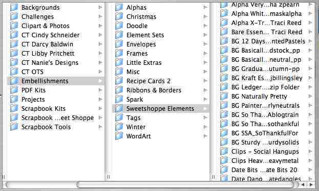
Hey there! First off, I need to apologize for doing such a bad job posting this last week. On top of trying to get my act together as a scrapbooker, I’ve also been confronted with some internet problems over the last few days, followed by a power outage, so there you know why things on my blog have gone a little slow, lately! Anyways, I’m back again, and today I’m going to allow you to take a look behind the scenes as far as storing your files is concerned. If you remember well, a couple of weeks ago I share with you how I organize files. Now, that was related to digital scrapbook products such as full kits. But there is a lot more available in the digiscrap markets than just full fledged kits. There are various kinds of element packs, paper packs, alphas, brushes, fonts and a whole lot more. So, today I’ll let you see how I organize these things. I like things simple. So, there are two kinds of folders that I …

Behind the Scenes: Typewriter Fonts

It’s about time that I’d take you to the world of fonts. For a long time, I’ve been intrigued by fonts, collecting them on my computer (and yes, I’m aware that people say they slow things down). Still, I can’t help myself – I do love fonts, and it’s great how you can put them to use in digital scrapbooking. So, today I want to talk about typewriter fonts. Tons of different typewriter fonts are out there – a lot of them for free. You can use clean types, but I especially love the ones that look old, worn, ragged. In general, typewriter fonts will give your page a kind of vintage look. They also work great when you combine them with handwriting fonts. On top of that they make great word strips, even work as titles. Here’s just a quick glance at some of my pages I did recently where I used typewriter fonts (simply click on the image to enlarge): Now that you’ve seen all this inspiration, of course you want to know, …

Behind the Scenes: Goals 2011

Let’s talk about our goals for 2011 today. I’m sure, everyone has goals that they want to reach, things they want to accomplish, hopes and dreams for the new year. Usually, I don’t like to think too much about goals, because my philosophy is: if you realize you need to change something or do something different or accomplish something, start today instead of waiting for the next year to come. Still, I think the turn of the year is a great time to reflect on the past and make some resolutions for the new year. So, this year, I decided to turn my goals into a layout, and here’s what I came up with: As I was brainstorming for this page, I realized that I have a lot of things I want to accomplish in 2011. And there are things I wish for, hopes I have, dreams. So, I decided I’ll put everything together into one page instead of making different pages for each of those categories. Now, you can see how I talk about …