

 One of the most basic rules for photography is the Rule of Thirds. It works quite simple, but can improve your image dramatically, when it comes to proper balance in your composition. The Rule of Thirds also can be applied generally in graphic design, which makes it quite a useful guideline for us scrappers as well. Now, keep in mind that when I use the terms, “rule” and “guideline” it doesn’t mean these rules are set in stone. Maybe the most important rule in graphic design is that “rules are meant to be broken!” So, when talking about the Rule of Thirds today, I’m not saying all your pages have to abide by this guideline from this day forward. It is meant as a tool, helping you to get better results when taking a photo, or putting your page together. But you may just as well ignore this rule, and still create a great scrapbook layout!
Still, as it is a rather useful tool, in our tutorial today, we are going to look at
- How to apply the Rule of Thirds in photography, and
- How to use it on our scrapbook layouts.
What is the Rule of Thirds?
Naturally, when looking at a picture, the human eye is drawn to a point about two-thirds up. This is where the Rule of Thirds comes into play. Basically, it’s the principle of dividing your image into thirds. Simply draw four imagery lines, two horizontal and two vertical – so that your image is separated into nine parts.

Rule of Thirds: Grid 1
Now, as you are taking pictures, important elements of the composition should be placed either right on those lines, or where these lines intersect. This helps to produce pictures that are well balanced and easy to look at. It helps drawing the attention to where your eye naturally would go on the image, and gives a better focus for what you want to highlight.
Look at this picture for example:

I could have just placed my friend in the center of the picture when I took this photo, and would have produced just another, very boring portrait. Instead, I placed him on one of the (imagery) lines, instantly turning this photo into an interesting image, with almost a somewhat dramatic effect.
Basically, the best places to position your main subjects are a third of the way up, a third of the way down, a third of the way in from the left, etc. – you already know what I mean. Bad choices to place your subject are in the center, at the very top/very bottom, or in one of the corners.
This rule will also have a very pleasant result when you apply it to photos with landscapes and scenery. Depending on what you want to emphasize, you should place the line of the horizon either on the lower of the two horizontal lines (focus on the sky), or the upper line (focus on the scenery).

How Does This Rule Apply to Scrapbooking?
As with photography, scrappers like us work with images – the scrapbook layout, for one, and of course, the photos we use on our pages. Therefore the basics of the Rule of Thirds apply to scrapbooking, too. We can take the same grid (above) and adjust it to fit our scrapbook page format (or any other format for that matter):

Rule of Thirds: Grid 2
When creating a layout, we work with lots of different elements. All these elements want to be placed nicely on a page, so that they all receive the proper attention. Knowing about the Rule of Thirds can help you decide where to place your photos, element clusters, journaling, and title. Depending where on the page you place each of these items, you have the power to decide how much attention you want to give each of those. You may want to say that you want to give your photo the main focus. So you will place it on one of the four lines, better even, where two of those lines intersect. If you place everything else apart from the lines, you will make sure, that your photo retains the attention. If however, you decide you want to give your title or journaling a more prominent role on your page, then you would also make sure to place them accordingly on the grid.
Let’s take a look at one example:

On this page, I placed basically everything on this one vertical line. The photo, more so the eyes of the person are arranged exactly where two lines intersect, which is one of the four most important areas on the page. The striped paper to the right, is just a little accent, but doesn’t draw much attention away from the main cluster at all. (At the time I created this page, I didn’t even use a grid, but you can see how well you can train your eyes to actually place things exactly where they need to be!)
 Here, I worked with two clusters, and again, both are placed exactly on the horizontal lines, allowing for a better focus than placing them anywhere between the lines.
Generally, using the Rule of Thirds has helped me immensely in my scrapping routine. When I don’t know where to start, or where to place one of my clusters, referring back to this guideline always helps.
It also applies to cropping a photo that I will use on a layout. Many times, the photos we use will be cropped to make them look better on our page. So, whenever you decide to change the framing of a photo, try to keep the Rule of Thirds in mind, and maybe you’ll end up with a much better picture-crop than expected.
One last thing …
Remember how I mentioned in the beginning that rules sometimes are meant to be broken? Well, one rule doesn’t really apply much to a scrapbook page at all: to avoid placing anything important in the center. When it comes to creating a scrapbook page, utilizing the center surely can pay off. I’m sure, all of us have seen many stunning layouts where the main cluster has been positioned right in the center of the page.
So, as you are trying to implement the Rule of Thirds on your layouts, don’t forget that this rule serves just as a guideline, and isn’t meant to be applied every single time!
By the way, my sister just hooked me up with another website, where I found this cheat sheet.
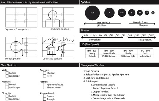
Cheat Sheet
It comes together with 13 other photography cheat sheets and contains these great sketches of how to use the Rule of Thirds (downloadable pdf file):


Close-up
Great tutorial, thank you for the cheat sheet links as well.