All posts tagged: behind the scenes

Behind the Scenes: How to Run a Photoshop Action Step by Step

Hinter den Kulissen: Wie man eine Photoshop Action schrittweise durchlaufen kann   Have you ever wanted to take a Photoshop action step by step in order to stop at an earlier point? Well, the problem with Photoshop actions is that once you start them, they’ll run through till the end, and there’s no feature to walk through an action step by step. And there’s no button to allow you to play a single step, either. Exactly this, however, is what I needed a couple of days ago when I wanted to run an action by Mommyish Designs. (If you don’t know Mommyish’s Photoshop Actions and Styles yet, you’re seriously missing out. They’re not only useful for designers, but for simple scrappers as well!) Anyway, I was working on this Document Christmas page for which I wanted to create a simple doodled outline. Seid ihr jemals an dem Punkt gewesen, wo ihr euch gewünscht hättet, eine Photoshop Action zu einem früheren als dem offiziell dafür vorgesehenen Zeitpunkt zu beenden? Das Problem bei Photoshop Actions ist, dass …

Behind the Scenes: Project Life Spreads that Catch Your Eye

Hinter den Kulissen: Projekt Leben Seiten, die ins Auge fallen   This year, I embarked on the journey of Project Life myself. Now, I’m a couple months down the road, and I thought to share some of the things I noticed creating PL pages that catch the eye.   Dieses Jahr habe ich mich auf die Reise mit Projekt Leben eingelassen. Jetzt habe ich schon ein paar Monate hinter mir, und ich dachte, ich könnte euch mal ein paar Dinge weitergeben, die ich gelernt habe im Bezug darauf, Seiten zu erschaffen, die ins Auge fallen.     First off, one of the greatest sources of inspiration for me is Pinterest, along with a couple of other websites such as the Studio Calico gallery, and the Two Peas in a Bucket gallery. I search those pretty much all the time when I need new ideas for my own PL pages. But as I search Pinterest, I’ve made an interesting discovery. My eye doesn’t get drawn to just about any PL page that is pinned to Pinterest. …

scrapbook layout

Behind the Scenes: Working with Patterned Background Papers

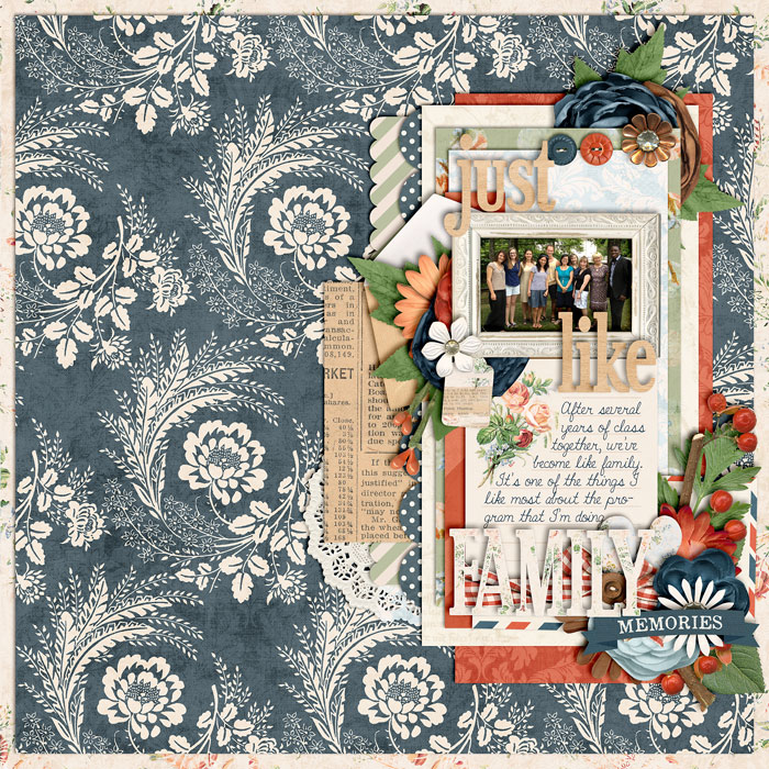
Hinter den Kulissen: Mit gemusterten Papieren arbeiten   Hey friends. After a long break I decided to start up my tutorial posts again. I’ve got a long list of things to talk about; now all I need is find the time to actually write up those tutorials.   Hallo Freunde. Nach einer langen Pause habe ich mich entschlossen, wieder damit anzufangen Scrapbook Anleitungen zu schreiben. Ich habe eine lange Liste von Dingen, über die ich sprechen möchte; jetzt muss ich nur noch die Zeit finden, diese Anleitungen zu schreiben.   Today I’d like to start simply by talking about patterned papers. While we love patterned papers (for me it’s one of the things that got me hooked on scrapbooking), some of us – especially those white space scrappers among us – can get quite intimidated to use patterned papers on the background. If anything, because it can make a page look really busy and might detract from the focal point of the page. I especially struggle with the journaling part when working with patterned backgrounds …

December Daily 2013

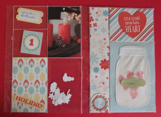
Dokumentiere deinen Dezember: 2013 One of my favorite projects to work on each year is the December Daily, which was started by Ali Edwards. If you’ve been around my blog for a while you’ll have noticed that I’ve been creating Albums that document my December for several years now (simply check out the tag “DECEMBER DAILY” to find all my previous posts regarding my DD journey – lots of photos, tutorials, etc.). Eins meiner Lieblingsprojekte jedes Jahr is das “December Daily,” welches von Ali Edwards ins Leben gerufen wurde. Wenn du meinem Blog schon eine Zeitlang folgst, wird dir nicht entgangen sein, dass ich in den letzten Jahren Alben erstellt habe, die meinen Dezember dokumentieren (falls du mistyhilltops.com erst kürzlich entdeckt hast, kannst du auf das Stichwort “December Daily” klicken, und du wirst alle meine bisherigen Artikel dazu finden – mit vielen Bildern, Anleitungen, usw.). This year, I’ve been thinking a lot, and finally decided to dare and do an all out hybrid album. It’s more work than digitally creating a page and simply printing …

scrapbook layout, outdoors, hike

Behind the Scenes: Adding Dynamics – The Angle

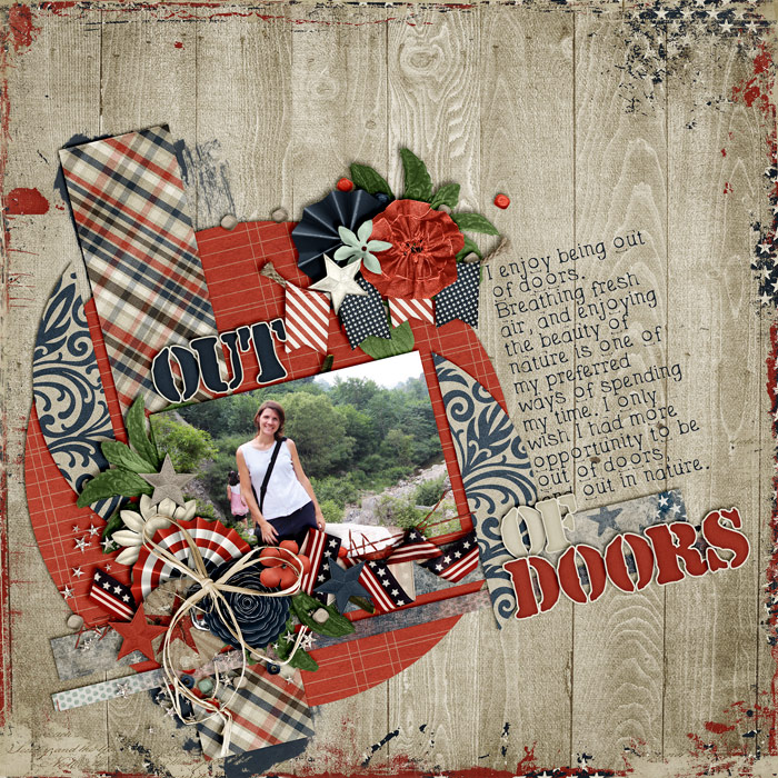
There are lots of ways how you can add dynamics to a page in order to make it visually interesting and captivating. One way of doing so is by placing things at an angle. Take a look at this page I created the other day with Libby’s new kit “We The People”: It would have just been another one of those circular layouts I’ve created lately, if it hadn’t been for the angle. The angle is what creates tension on an otherwise pretty simple page layout and composition, which makes it visually interesting. All of a sudden, the page stands out from the rest, and that is because of the angle I added.   How to Add an Angle Usually, I begin by just scrapping my page, adding paper layers and clusters, my photo(s), the title, and the journaling. If you wait with rotating everything to the very end, you save yourself a lot of guessing work and having to rotate everything individually. After creating your page, simply select all the layers you want to …

Behind the Page: Happy Little Moments

It’s been a long while since I did a tutorial post (though I’ve got lots of stuff to talk about, I simply haven’t had the time to work on something). But today is a day on which I’d like to take you behind the scenes of one of my pages – the thoughts, the processes, what helped me put this page together.   Take a look at the layout “Happy Little Moments” created with the kit “Super Mom” by Heather Roselli (Sweetshoppe Designs):     In this post you will learn about: Mats – how to use them for contrast between patterned pages; The Visual Triangle – how to create a visual flow in your composition; Journal Strips – to set off your journaling.   The kit comes with lots of gorgeously patterned papers, and I really wanted to use some of those patterns on my page. The problem with patterned papers is that they can quickly make a page come across too busy, or photos, elements and journaling might get lost in the mix …

scrapbook layout, outdoor, weather

Behind the Scenes: Scrapping with Themed Kits

Themed kits are great for scrapping a very specific topic. I have lots of themed kits in my scrap stash, ranging from sports and outdoors type topics to seasonal, games, hobbies, male/female, and whatever other topic you may think of. And of course, they are perfect to scrap on that very particular topic. But themed kits are useful for a lot more than that. Being part of the creative teams of quite a couple of designers, I frequently run into the problem that my designers whip up gorgeous products for which I have absolutely no photo to match, and while I could just opt for scrapping a photoless layout, I can just as well choose to ignore the fact that the kit is themed and use any photo I like to scrap a page that has nothing to do with the theme of the kit.   Tips to Help You Scrap Non-Themed Layouts with Themed Products Stay generic Only use those papers and elements that are just about included in every typical kit, esp. embellishments …

scrapbook layout

Behind the Scenes: The Evolution of a Digital Scrapbooker

Tons of people dream of getting a spot on various CTs for their favorite designers. Some people’s dreams come true, others still wait for them to be discovered. If you’re someone whose just started out on digital scrapbooking recently, I may offer you a piece of advice: be patient. Developing your scrapbooking skills takes time. It also takes determination and a desire to do the job well. There are various skills a digital scrapbooker needs to develop in order to make a page interesting and looking well. If you desire to improve your scrapbooking skills, don’t neglect those areas: Composition It’s a major part of a scrapbooking page. If you just scatter things randomly on a page, chances are that it probably will look like that: a simple scattering of elements and stuff. Nothing to draw the eye. Anyone involved with art, however, will know that our eyes wander, and by the way we position things on our page, we can give our eyes direction, and make them wander on purpose – there’s a flow. …

scrapbook layout

Behind the Scenes: A Case for Digital Scrapbooking

I’m sure it hasn’t gone unnoticed: I love digiscrapping. I love the creative outlet it gives me to play with beautiful papers (one of my oldest passions), messing around with colors and art, and on top of that to combine it with another one of my passions – photography – while at the same time being able to preserve memories and keeping a track of what’s going on in my life.   I love all of that! But what’s best about it: I never have to worry about the creative mess that comes with actual art projects. There’s no real cleaning up to do afterward, and yet, the results can be stunning, and they can bring joy to others. Another biggie that kind of got me hooked to the digital side of scrapbooking, is the fact that you get to scratch things and start all over again, without losing anything but the time you’ve invested. I remember well, when – in the past – I got myself a nice stack of pretty scrapbooking papers (the …

scrapbook layout

Behind the Scenes: 4+ Ways of Scrapping Double Page Spreads

When it comes to scrapping pages for photo albums and such, my preferred way of scrapping the memories is by using double page spreads. Of course, as with everything you do in scrapping, there are lots of choices as to how to go about your designs. When working with double page spreads, I’ve found there are four ways of how you can scrap them: One combined layout, using a composition that includes your entire spread. A two-page layout, using the same products. Using two pages with different products to scrap about the same topic. Two single page layouts with different products and different topics.   Option 1 | A Combined Layout This option means you would create a two-page spread like a single unit. Personally, it is my preferred choice to scrap two page spreads for an album, because it makes the two pages look like one large layout.     Option 2 | Two-page Layout with Same Product Another favorite option of mine is to create two separate layouts for a double page, but …