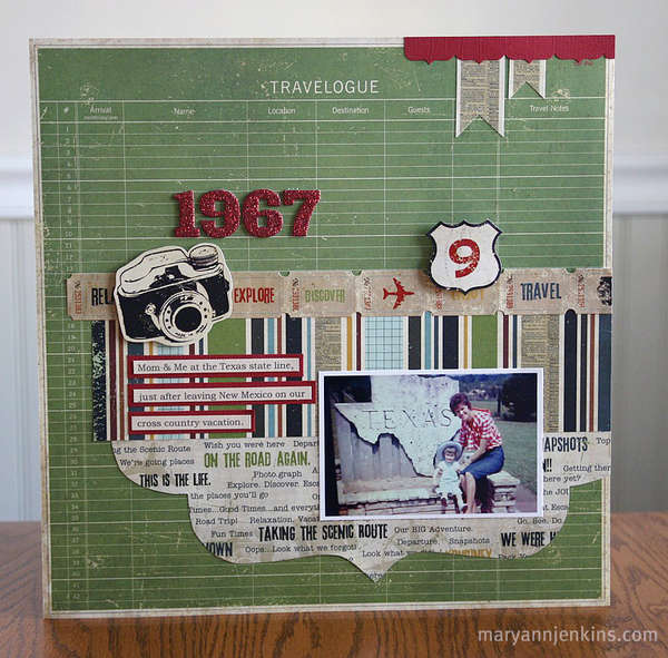
New Saturday, new P2D inspiration. Today, I’d like to show you a page, for which I used to traditional paper layouts as inspiration.
What caught my eye with “City Girl,” was the background paper – showing a city map (similar – or maybe the same papers – are available at Designer Digitals), and the overall composition.
From the second page, I took the road sign, ticket border, and the journaling strips.
Now, for my page, I didn’t have any map background; but I figured out a perfect solution. My China Lonely Planet has lots of simplified black and white maps. I simply scanned in one page with the Shanghai map, played a bit with various blending modes, and there: I had the perfect solution, and a pretty cool map background. Worked for me! Here, I’ll show you my page, too:


