
Mein Tagebuch: November
Wow! Can you believe it’s November already? Where did the year go? Anyway, it’s time for new prompts in my journaling café, and according to season it’s about November life. Check out the inspiration below:
Wow! Könnt ihr glauben, dass es schon November ist? Wo ist das Jahr nur hin? Naja, jedenfalls wird’s Zeit für die neuen Ideen in meiner Tagebuchecke. Und da wir nun schon mal November haben, geht es vor allem ums Leben im vorletzten Monat des Jahres. Seht euch mal die Vorschläge an:

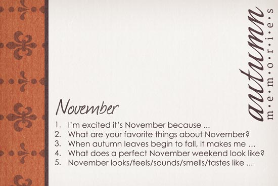
November
- Ich freu mich, dass es November ist, weil …
- Was magst du am November am liebsten?
- Wenn die Herbstblätter von den Bäumen fallen, dann …
- Wie sieht das perfekte Novemberwochenende aus?
- November fühlt sich an/sieht aus/klingt/schmeckt/riecht wie …
And here’s a page that I created based on one of these prompts:
Und ihr ist eine Seite, die auf einem der Vorschläge beruht:

I absolutely love your layouts and I love your journal suggestions. I am new at it so it really helps me out. I have a question about how you journal in your layouts. Your lettering always looks as if its written directly on the paper. Mine never quite looks that way. Although I use a handwritten font it just looks like type on top not as if its actually on the paper. Is there anything special you do to the layer to make it look that way? I use Photoshop CS6. Cheers and thanks!! Karry
Karry, thanks for your nice compliments. To answer your question, I usually don’t do anything special to my fonts when I place them on plain paper like I did on the layout you see in this post. So, I don’t really know why your font looks so unrealistic. Have you tried using a different font? (There’s tons of free ones out there that you could download and try.)
There are, however, times, when I do do something to my fonts, and that is when the background of my journaling area is markedly textured (e.g. woodgrain, folds/creases in paper, etc.). It’s a very simple little technique that can give stunning results, and if you still don’t like the way your fonts look after trying out different ones, this would be definitely something you should start doing. I wrote a tutorial about this technique a couple of years ago, and you can learn about it in this blog post: http://mistyhilltops.com/digiscrap-corner/digiscrap-talk/behind-the-scenes-making-fonts-look-real/. Once you get the hang of it, it’ll only take you seconds to apply this technique and hopefully it will help you make your fonts look realistic.
Is there anywhere I could take a look at one of your layouts? I’d love to see for myself what your font looks like on a layout.