The other day, I created a layout on which I used a leaf for my journaling, and after uploading it to the gallery, I got several comments because of that, so I thought, today I’d show you how to create a journal mat just like that, using custom shapes and working with a text path. Anyways, I haven’t done a tutorial in so long, it’s really time for something new …
In this tutorial you will learn how to …
- … create a custom shape and clip a paper to it;
- … ink the edges for a more worn look;
- … create a text path from a custom shape and fill it with your journaling;
- … add a border to your shape.
Here is how it works …
Step 1: Create a Custom Shape
On your canvas, go to “Custom Shapes” (U), choose a shape, and holding down the shift key, create a proportional shape.
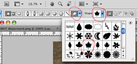
Custom Shapes
Step 2: Rasterize Shape
Rasterize the shape.
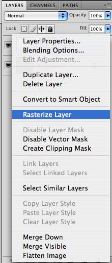
Rasterize Layer
Step 3: Create an Expanded Selection
With the Magic Wand Tool (W), click on the layer to make a selection (marching ants).
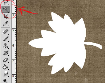
Magic Wand Tool
Modify your selection by expanding it: Go to “Select” – “Modify” – “Expand.”
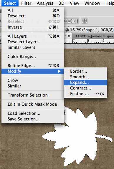
Expand Selection
Expand by a value that will make the new layer slightly larger than the original (I chose 25 pixels).
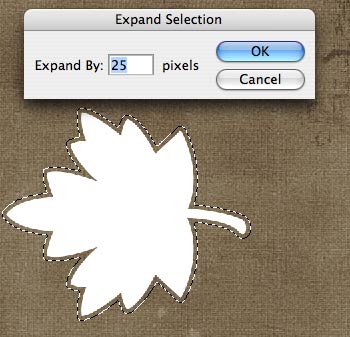
Expand by: 25
Step 4: Create a New Layer
Create a new layer (windows key + shift + N), and fill it with the Paint Bucket Tool (G). The color doesn’t matter since this is only our clipping mask. Make sure to place this new layer underneath the smaller one (Shape 1 in the image below).
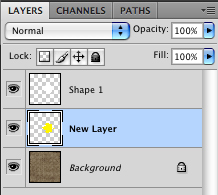
New Layer
Step 5: Clip Papers & Merge Layers
Pick two papers from your digistash and clip them to both layers. They can be patterned papers, but if you want to use this as a journaling mat, than I’d definitely recommend solid papers. I chose a light and a darker yellow. Merge each paper with its shape. (Don’t merge both shape layers, you want to keep them separate!)
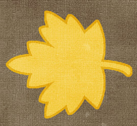
Clip & Merge
(For beginners …)
You can clip the paper to the shape in the layers panel, by placing the paper you want to clip right above the shape you want to clip it to. Hover with your cursor between the paper layer and the shape layer, while holding down the “Alt” key. Two intertwined circles will appear. Just click, and the paper will take on the shape of your custom shape. Merge by selecting both paper and shape layer (in the layers panel), and then pressing the windows key + E.
Step 6: Rotate Shape Layer
Slightly rotate your two shape layers (windows key + T) by dragging one of the corners of your selection.
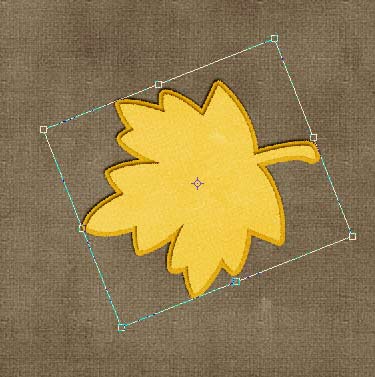
Rotate
Step 7: Add Shadows & “Inner Glow”
Add your shadows to your two shape layers, just as you usually would do. Then add an “Inner Glow” blending style to both of your shape layers. (For a more detailed tutorial on “Inked Edges,” see one of my older posts HERE.)
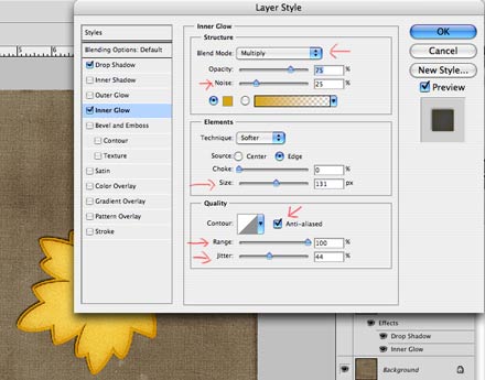
Inner Glow
I chose the following settings.
Blend Mode: Multiply
Opacity: 75%
Noise: 25%
Color: A darker shade of your paper’s color
Size: 131 px
Anti-Aliased: checked
Range: 100%
Jitter: 44%
Depending on your shape and paper, you might have to slightly adjust your own settings.
Step 8: Create a Contracted Selection
With your Magic Wand Tool (W) select your top shape layer again. (Click outside the layer, and invert your selection – windows key + shift.) Modify your selection, this time by choosing the “Contract” option (“Selection” – “Modify” – “Contract”).
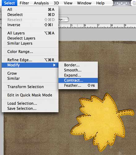
Contract Selection
Choose a value that will slightly reduce the size of your shape layer. I choose the value of 20 pixels, though you might have to use a different value, depending on the size and kind of your shape.
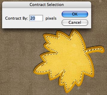
Contract By 20
Step 9: Create a Work Path
From your selection create a Work Path. Press M to bring up your Marquee Tool, then right click inside the selection (marching ants). A pop-up menu will appear from which you will be able to select “Make Work Path.”
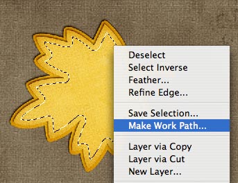
Make Work Path
Step 10: Type Your Text
Choose your text tool and the font you want to use (also pay attention to the color of your font), then click inside the path (near the top of where you want to begin to write) – the text cursor surrounded by dotted round brackets ( ) should appear as soon as you hover within the parameters of your work path. Type your text. The smaller the font, the easier it will be to fill out all the corners of your shape. You might want to adjust both the size of your font as well as as the alignment of your paragraph for a better (less jagged) look of your journaling. Play a little with your settings to see what looks best.
Step 11: Create a New Layer for the Border
Now that your text is completed, we want to add one last thing: A light border around your text. For this, begin by adding a new layer to your layers panel (windows key + shift + N).
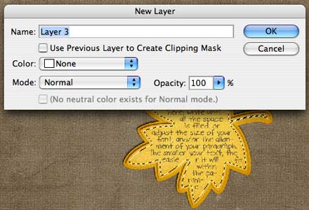
Create New Layer
Step 12: Make A New Selection
Make a new contracted selection (see Step 8 – I used the same contraction value of 20 pixels, but you might need to adjust your value).
Step 13: Stroke Selection
This time, instead of creating a new work path, we will stroke our selection, but the procedures are similar to Step 9. Just make sure your Marquee Tool (M) is selected. Right click inside your selection, and the same pop-up menu will show as in Step 9. This time, choose “Stroke” instead.
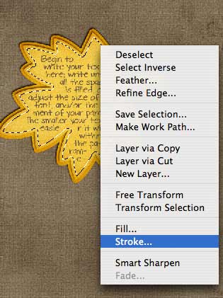
Stroke
A new window will open, in which you can adjust your settings. The only settings I modified here were the two top ones: Width (8 px, but you might have to choose a different one), and Color (same as font, but can be different, too – your call!).
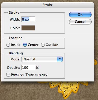
Stroke Menu
Click OK, and your selection should have a stroke now. Press D to remove your selection.
Step 13: Add a Blending Style to Stroke Layer
Last but not least, we want to make your stroke layer look a little more natural than just pasted on top of your shape layer. Just double click on your stroke layer to bring up the Layer Style Menu.
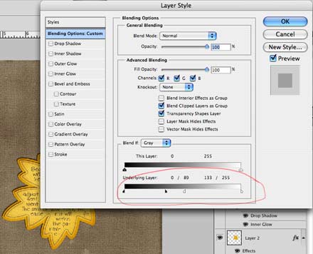
Add Blending Style
Make sure, it shows the page with the “Blending Options.” At the very bottom, you will find a field “Blend If.” Adjust the bottom slider until you reach the desired look for your stroke layer. (For a detailed tutorial on how to fully utilize this blending option for a realistic look, see my one of my other posts on “How to Make Fonts Look Real.”)
If your underlying paper has a strong texture, you might want to add the same blending style to your text layer.
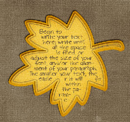
Finished Journal Mat
That’s it. You just created a custom shaped journal mat filled with your own journaling!
Here is a close-up shot of my finished layout, using this method:
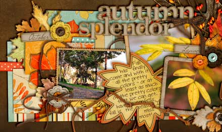
Close-Up


Thanks you so much for this tutorial, I’ve learned so many new things…