I’m excited, because today I’m going to show you one of my favorite techniques in digi-scrapping. I use it on almost every single page I create, and even though the title says that it’s related to fonts, you really can use it for everything – photos, brushes, stamps, rub-ons; everything that you put directly on a textured paper and want the texture to show through.
The Example
Let me give you an example: You’re writing something on a paper background, but that background has wrinkles and folds. Simply placing your text on top of that will make your journaling look unnatural, and as if the font is kind of floating. That’s what you do not want to happen!
Take a look at this page that I created back in April:
It has some journaling on some pretty wrinkled/folded paper. Now, let’s take a closer look at the journaling:
This is what the journaling would look like, if I don’t make any adjustments to the text. The letters simply ignore the folds, which makes everything look pretty unrealistic. Then, with just a few simple steps, I applied my technique, and ta da – here’s the result:
Sure, the journaling is a little more difficult to read, but naturally that would be the case, if you wrote on a piece of cardstock that got folded various times and was a little worn.
So, how did I do that?
Here is how it works …
Step 1:
Write your journaling text, and place it where you want it on your page (no worries, you can change the position of your text any time, and this technique will still work).
Step 2:
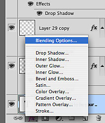
Double click on the text layer (in your layers panel) to bring up the “Layer Style” window. (Clicking on the little FX symbol at the bottom of your layers panel, and then choosing “Blending Options” from the menu will also work.)
Step 3:
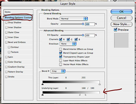
At them bottom of your “Layer Style” window, you will find a little section that says “Blend If … .” There are two sliders; I usually only play with the bottom one that says “Underlying Layer.” Both sliders have two arrows. A black one, and a white one. The black one modifies the dark shades, the white one the lighter shades.
Start playing around with these and watch how they effect your text. There are no fixed settings for these, the settings are different with each underlying layer and each top layer that you work with, so you have to try and see. You can slide both, the black and the white arrow to modify your layer.
Tip:
Try holding down the ALT key. With this you can separate the arrows, and can modify which areas will still show, and which areas of your layer will disappear.
Basically what happens is, when you slide the black arrow(s), the darker parts of the layer that shows underneath your text will start to disappear. When you slide the white arrow(s), the lighter parts will begin to disappear. Play around with these, until you have the desired result.
That’s it! Real easy! It usually takes only a few seconds to do this.
You can also use this technique for brushes, stamps, and even photos, if you want the texture underneath to show a little. Like I said, I use this technique on almost every single layout. Here is a more recent page I did, using exactly this layer style option:
The texture and highlights of the wooden background beautifully show through the blended photo image, making it look like it’s been really rubbed onto the wooden surface.
Well, I hope you found this tutorial useful, and if this is new to you, I’m sure once you start using it, you’ll quickly love this technique just as much as I do.


