All posts tagged: tutorial

Behind the Scenes: Enhancing Legibility of Your Journaling on Patterned Papers – Part 4.

Over the last couple of weeks, I’ve already shared various ways of how you can make your journaling shine on patterned papers. Today, I have another installment – I want to focus on the use of labels or journaling mats.   Using Labels to Draw Attention to Your Journaling   Lots of scrapbooking kits already come with pre-made blank labels and journal mats. So all you have to do, really, is just make good use of them. Journal mats are great for focusing attention on your journaling. They give the eye a place to rest on an a page that may be quite busy otherwise. They are great for various different uses. Lists You can use journal mats to create lists. Take the following page, for example: To draw attention to an otherwise boring list, I used lots of various labels to talk about my monthly favorites.   Titles & Word Art Journal mats are also great for creating titles and other word art elements. For this page, I used journal mats for both, my journaling and …

Behind the Scenes: Enhancing Legibility of Your Journaling on Patterned Papers – Part 3.

In my little mini-series of working with journaling on patterned papers, I’ve already mentioned a few strategies. But there are even more ways of how you can make your journaling stand out on  patterned papers. Another method I’ll discuss today: Creating Journaling Strips   The magic word for this solution – and one that I’ve started to use over and over on my own pages – is: Journaling Strips. You can have the wildest patterns going on on your pages, but if you use journaling strips, none of that matters. Take a look at some sample pages of mine, where I used journaling strips on patterned background papers: And this, of course, was a more recent P2D feature: The plus side of journaling strips is: They usually are really easy to create, you can use them on all sort of pages, and they usually do a really good job at drawing attention to your journaling (even on solid backgrounds).   How to Create a Journaling Strip   STEP 1 | Use the Shape Tool to …

Behind the Scenes: Enhancing Legibility of Your Journaling on Patterned Papers – Part 2.

When working with journaling on patterned papers, one of the things I like to do is adding a slight brush layer, as I recommended in the first part of this tutorial. So, today, I’m going to show you how to do just that: Adding a Brush Layer to Enhance Journaling Take a look at this page: On a slightly striped paper, I wanted to add some journaling. But after I added it, I realized the striped pattern was just to strong -the journaling lost its focus. So, if you look more carefully, you can see how behind the journaling, the stripes are nearly wiped out, and I did it by adding a brush layer. And here’s how it works … (I’m assuming that you already added your journaling to your page, and that you placed it somewhere on top of a patterned background.)   STEP 1 | Add a Layer Above Your Patterned Paper To avoid messing with your patterned paper, simply select that paper layer in your Layers Panel, and add a new layer …

Behind the Scenes: Enhancing Legibility of Your Journaling on Patterned Papers – Part 1.

I  love patterned papers. I think it was the pretty papers that actually got me hooked to (digi) scrapping in the first place. So, when creating layouts with some of the beautiful kits the designers create, of course I like to have some of the patterns shine. Often, however, using patterned papers as a background of a layout can be quite distracting, and the journaling at times can become pretty much illegible when we try to write on patterned papers. Throughout the years of my scrapbooking journey, I’ve discovered a few ways of how to find a happy compromise between using patterned background papers and making them work on a layout. One of these little tricks I will share here with you today, and the magic word is … Blending Take this layout, for instance: I used Dani Mogstad’s cute winter kit “Chill Out” for this, which has quite some pretty patterned papers, including the snowflake paper I used for the background. While working on the page, however, I realized that the pattern made the …

Behind the Scenes: Creating Shapes With Fixed Sizes

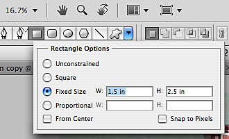
I have a very quick little tutorial for you today. Time and again, I’ve wondered how, in Photoshop, I can create a shape, say a rectangle, with a fixed size. Sometimes, esp. when I do hybrid projects, I really need to have something of a specific size to meet my needs. Other times, I like to work quite precisely on a layout (I’m a perfectionist to some degree, you’re right!), and then being able to know how to create a shape of an exact size can come in handy. So, the answer to this little question is actually really simple. Take a look at this little image, and this is all there is you need to know. For real! Ok, ok. I’ll give some explanation, too.   STEP 1 | Select the Shape Tool Start by hitting the key U, or clicking on the icon for the Shape Tool in your toolbox of your Photoshop screen (it’s on the left side of my screen) to open the Shape Tool. At the top towards the left …

Behind the Scenes: Create Your Own Layered Christmas Tree

Christmas 2011 officially now is a thing of the past. But for us scrappers the good news is that our holiday scrapping is just beginning, since I’m sure that most of us have a lot of memories that we want to preserve with your layouts. It’s the perfect timing, therefore, to bring you this little tutorial on how to create your own paper clipping Christmas tree. Check out my DD cover page, and the tree you see there is what you’ll learn to do in today’s tutorial:   In this tutorial you will learn how to …   … create your own clipping masks using a custom shape; … rasterize the custom shape; … divide the custom shape into various fields/shapes by using the Eraser Tool.   Here’s how it works … I’m assuming that you’ve already opened your canvas, and are ready to start …   STEP 1 |  Create a Triangular Shape The first thing we need to do is create a triangular shape. Simply press U to bring up the Custom Shape …

Behind the Scenes: The Key to Clustering

Composition and element clusters often make or break a scrapbook layout. With all the templates that are circulating the market these days, clustering has been made a lot easier, and yet, I still hear more than enough comments about how people just don’t know how to create pretty clusters. If you’re one of them, then this tutorial is for you!   In this tutorial you will learn how to … … add elements, and arrange them in such a way that they create clusters.   Here’s how it works … Lets get started. I’m going to take you step by step, as I am creating one of my December Daily pages. STEP 1| Add Elements You Desire to Use on Your Layout I’ve already prepared my page so that I only need to add and arrange the elements. KEY #1: The order of when you add which element doesn’t matter. First, I just go through the element folder of the kit I’m using and pick a couple of the elements I’d like to add. I …

Enable Me: Creating A Custom Shaped Bokeh

I stumbled upon a super fun and easy tutorial recently about how to take pictures in which the lights take on fun shapes. As soon as I saw this, I knew I’d have to try my own hand at this, and true enough, it’s just as simple as it seems in the tutorial. So, if you want to know how to take pictures with a bokeh such as this one, simply hop on over to Kevin’s and Amanda’s blog to check out their tutorial.

Behind the Scenes: Re-Coloring Overlays and Brush Layers

As promised last week, I have a very quick and short tutorial today on how to re-color brush layers and overlays (ie. as used in my current December Daily project). (See the overlay with the date cluster that frames the journaling page.)   In this tutorial you will learn how to … … add a Color Overlay Style to your brush layer (or overlay).   Here’s How It Works …   STEP 1 | Add a Color Overlay to Your Layer Assuming that you already have your canvas open and created a brush layer (or any other kind of solid colored overlay), in the Layers Panel, double click on the layer that you wish to modify. That should bring up the Layer Style menu (or click on the little fx symbol at the bottom of your Layers Panel). On the left side of the pop-up window, you will see a list of Styles options. Check “Color Overlay” to open that menu. Click on the little color box (by default it’s red in my version of …

Behind the Scenes: How to Create Custom Shaped Text Paths

If you’ve seen my recent posts, you’ve probably stumbled across my December Daily pages. If you took the time to look at one or two, you might have noticed how the journaling wraps neatly around all the embellishments without really interfering with them. Today, I’m going to show you how to create such a text path that is customized to wrap around your elements and clusters. (This is useful not only for December Daily projects, but for any layout that requires a custom shaped text field.)   In this tutorial you will learn how to … …  make a customized selection (based on your element and text layers); … contract your selection; and … turn your selection into a text path.   Here’s How It Works …   STEP 1 | Duplicate and Merge Layers Assuming that you’ve already put together your layout, including all the embellishments and element clusters you have wanted to add, go with your cursor to the layers panel, and select all the layers that you want your text to wrap …