All posts tagged: tutorial

Behind the Scenes: 6 Ways of Scraplifting

Who of us hasn’t stumbled upon a pretty scrapbook page in one of the galleries, and thought, Oh man, why haven’t I come up with the idea for this page? That, however, doesn’t mean you still can’t use that idea on one of your own pages. The solution to the problem? Scraplifting, duh! But there’s more to scraplifting than scraplifting, if you know what I mean. There are lots of ways, in fact of how you can lift someone else’s layout.   No. 1 | Whole Layout Probably the most common way of scraplifting (at least for my part) is to reproduce the whole page. You take a layout, look at the way papers and elements are arranged, and then you copy that straight onto your own canvas.       No. 2 | Clusters Another way of scraplifting is to take one cluster and reproduce it on your own page. This could be the main cluster of a composition, but leaving out other details, or it could be parts of a cluster. Lifting clusters of other …

Behind the Scenes: Creating Paper Pockets

Alright, friends of the digital scrapbooking business, if you remember well, then you’ll remember that I promised you the other day to show you how to create pockets like the ones on the Project Life layout I shared with you the other day. This one: It’s actually a fairly simple process, and doesn’t require much skill at all. Soooo …   Here’s How it Works Step 1 | Create a Rectangle On your canvas, add a new layer to your Layers Panel (windows key + shift + N – on my computer), and activate the Rectangle Tool (shortcut U). Draw a rectangle of the size you desire, and rasterize it (right click on the rectangle layer in the Layers Panel and choose Rasterize Layer from the options you are given). Step 2 | Create a Circle Now, you want your pocket to look like a pocket (of course, or else it wouldn’t be a pocket), so for that you want a little semi-circle to be cut out from your shape. Similarly as in step one, …

Behind the Scenes: Creating Dashed Lines in Photoshop

Stitches always make a good impression on any scrapbooking page. Lots of designers create awesome stitches which they sell in their stores (just check Traci Reed’s sewing line over at sweetshoppedesigns.com, if you don’t know what I’m talking about), but it’s actually not that hard to create similar effects on your own in Photoshop. All you need for starters is a dashed line, and today, I’m going to show you how to create dashed lines in just seconds! All you need to do is, create a new layer (windows key + shift + n), and then use a brush.   Here’s How It Works Open your Brush menu. In the Brush palette, choose a default round, hard brush. Now, change the roundness to something like 15%, and the spacing to whatever parameter you prefer (for the stitched line above, I used 650%).   Draw your line. To add more texture to your dashed line, you could add a style, and that’s pretty much it. Take a look at this P365 layout that I created the …

december daily, digital scrapbook album

Behind the Scenes: Creating a Frosted Look

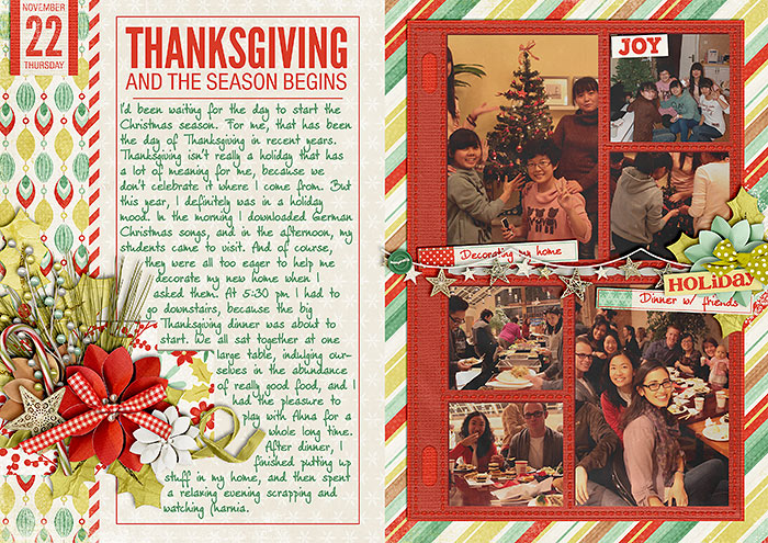
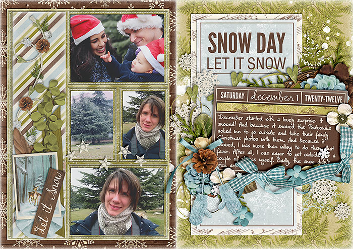
Christmas time is winter time. At least where I’m from. And who of us doesn’t dream of a white Christmas? As many of us are moving into the cold season, we also get to scrap more of those chilly, frosty memories. So, I think it’s the perfect time to talk a little bit about how to add a little bit of frosting to our pages. If you’ve seen some of my December Daily pages this year, you may have noticed that some of them come with a nice frosted feel to them. And if you’ve wondered how to create this effect, I can tell you: it’s super simple. Take a look at one of my early DD pages: If you take a closer look, you’ll notice that around the edges some of my papers seem to be frosted. You can easily add your own frost layer by playing just a little with your style settings. (This technique can be applied to papers, elements, as well as text.) Here’s how it works … Choose the paper or …

december daily, digital scrapbook album

Behind the Scenes: December Daily Twenty-Twelve

Like every year around this time, all the talk is about the December Daily project. So, for today’s tutorial post I’d like to take you behind the scenes of my own DD project this year, sharing some of my thoughts and processes.   Last Year If you have looked at my DD album from last year, you will have noticed that all my pages were based on the same foundation page: photos on the left (stuck into photo pockets), journaling on the right side with two clusters of embellishments, the title, and the date info. I had created myself a foundation page template which helped me jump start each page quickly, and without having to spend much thought on composition, choice of papers, and placement, scrapping each page was a breeze. Even now, one year later, I still love how my pages turned out, and when I first started thinking about this year’s DD project, I was seriously tempted to just use the same template and format again. The thought of having two very similar …

Behind the Scenes: Using Paper Piecing Patterns with Digital Scrapbooking

The holiday season is upon us, and that means some of us are busy busy making cards to send to loved ones and friends. I at least have made it a priority again this year, to create more handcrafted cards, after I failed at it miserably last year. And since I’m someone who tends to get bored with repetition, I’m always looking for new ideas that I can incorporate in my own card making. The www is a great source of inspiration, and over the last couple of weeks, I’ve been able to dig up some treasure or other to inspire one of my own cards. Being a person with both limited time and limited resources, however (craft stores where I live are not what craft stores are in Northern Europe or North Amereica), I have a few guidelines to govern the choice of projects I create: They have to be simple in design, and they have to be with materials I have at hand (printer, paper & maybe a ribbon). A very fun way …

Enable Me: Creating Sewing Stitches in Photoshop

The other day, I was looking for a tutorial on how to create your own realistic looking sewing stitches, and I found this neat website HERE. Of course, for stitches you can always buy one of those element packs some of the designers put out (e.g. see Traci Reed’s, Anna Aspne’s, Erica Zane’s stitch packs, to mention just a few). But sometimes, you want something that none of the designers offer – an odd shape, a letter, etc. That’s when this tutorial (and the actions it offers) comes in handy, so I recommend that you hop on over and check out what cadjunkie has to say about sewing stitches and photoshop.

Behind the Scenes: Must-Haves in My Scrap Stash

Let me get really basic in my Tuesday Tutorial today. As my external hard drive (on which I keep all of my digiscrap supplies) has been acting up recently and I haven’t been able to access my stuff without the hassle of first having to copy what I want to use from the hd to another device before I can use it on my computer, I came to realize one thing: There are some things I can live without ready access (i.e. kits because I’ll use them once initially, and then later maybe again), and there are some digiscrap supplies that I just can’t live (and scrap) without. They are filed in my folder named “embellishments”, and include a range of different products. And while I use some of these element packs rather rarely, there are those, which I check out almost every single time I create a page (that’s not for CT purposes) to see what I can use on my layout. Here’s a list of what I found to be indispensable additions to …

Behind the Scenes: Distributing Elements Evenly

To start out my Tuesday tutorials after the long break, I thought I’d share with you one nifty little tool that I use all the time. It’s the Alignment Tool, which you’ll probably find somewhere at the top of your photoshop screen (if your workspace is in any way similar to mine). The Alignment Tool comes in handy when you need to arrange things, and you want to make sure they’re placed correctly in relation to other elements on your layout. When working with alphas, I use the Alignment Tool all the time. But also when I want to make sure an element is exactly in the center of a specified space. Instead of playing the guessing game (and wasting a lot of time trying to align things manually), I refer to the Alignment Tool. Option 1 | Aligning Elements in Relation to Each Other When aligning elements, all you need to do is select the layers of all elements you want to be in line in the layers panel. As soon as you select …

Behind the Scenes: Creating Your Own Labels

With the Project Life being such a rage, labels have become really popular over the last couple of months. A lot of designers have picked up on the trend and regularly provide PL-type labels in their kits. Oftentimes, however, I find myself still not having exactly the kind of label I’m looking for on my layout. My answer to this problem: I sometimes create my own labels. It’s quick, it’s easy, all I need is paper (patterned and solids both work), and I’m ready to create my very own label that perfectly suits my needs. Take this layout for example: This kit “Sweet Caroline” by Kristin Cronin-Barrow didn’t include any suitable label that would fit in the little compartment of the tray that I had chosen for my journaling. No problem, I thought, I’m just going to make my own label that will fit just perfectly. Here’s how it works …   In this tutorial, you will learn how to … … create a shape layer, … duplicate the shape layer and erase parts of …