All posts tagged: p2d

scrapbook layout, school

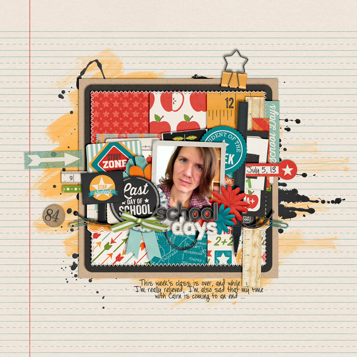
P2D – School Days

The www is so full of inspiration, and the fun is, you can just use whatever you find as a launch pad to jump start your page and go from there! For today’s post, I found this lovely paper layout “Blues.” I loved the grid design, and yet, it’s so packed with embellishments, layers, and things to discover. Just the very things I like about a scrapbooking page. So I took this page as inspiration for a page of my own …

scrapbook layout, beach

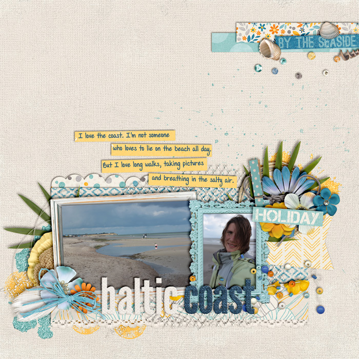
P2D: Baltic Coast

Two Scrapbook Friends is a website with traditionally scrapped layouts, and one of those pages stood out to me so that I decided to lift it digitally: Snowmen by maxadriane   Features I loved about this page (and wanted to incorporate on my own page) were the overall composition, the journaling strips, the title, and the placement of embellishments, and the two photos. And here you can take a look at my own page:  

scrapbook layout

P2D: Afternoon in the Fields

Some websites have a great number of inspirational layouts. Sketchabilities is one such website that comes up with awesome sketches that are easy to scraplift digitally. Take a look at this layout: It was based on this sketch: I took the inspiration and tried to create a page that featured the following characteristics: One large central cluster on a round, scalloped mat; two smaller clusters at the top and bottom edges of the layout; two photos; embellish each cluster with a number of flowers and other elements. And this is what I came up with:

scrapbook layout

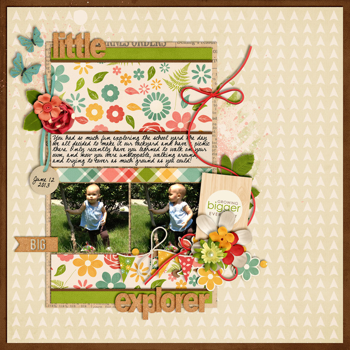
P2D: Little Explorer

This week, I found a page created for paper crate that I found intriguing to scrap lift and turn into a digital layout.   I scrapped about a recent picnic with my friends using the composition of this page, and the placement of papers, photos, and embellies as approximate guideline for my own page. Of course, being someone who loves to cluster, I had to add a couple more elements to my page, and switch out the placement of the title. Here’s how my digital version turned out:  

scrapbook layout, asia

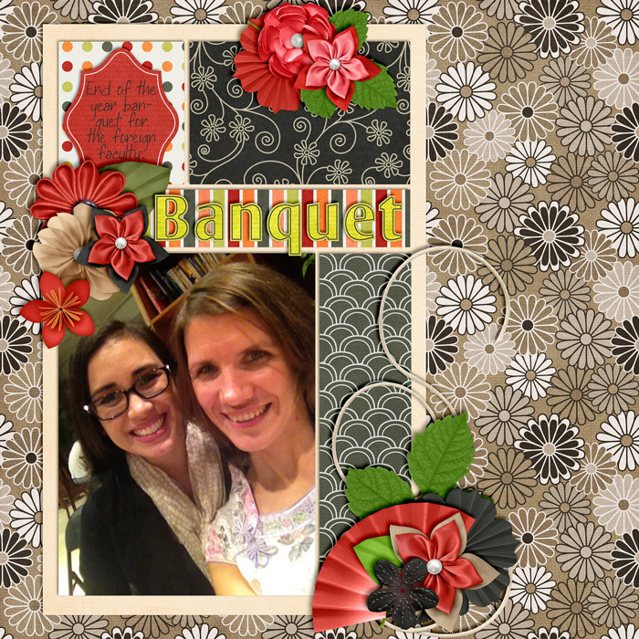
P2D: Banquet

I got inspired again. This time by a page which (admittedly) isn’t a traditional paper layout, but it still inspired to do a scraplift. (Of course not without my own modifications to give it my own style and stamp.) Here’s the page that I found:     And here’s my own page I did, using Lliella Designs’ Asian themed “Oishii” kit:   As you can see, I added a few more clusters, switched out the positions for journaling and titles, and thus made this page my very own. Why don’t you go and find yourself a layout (from the paper scrapping world) and turn it into a beautiful digi-page of your own making?

P2D: Field Trip

There is so much inspiration you can get from traditionally scrapped paper layouts. The possibilities are endless. Take this page for example from the Crate Paper Blog: I love the blocked design and all the bits of embellishing that make this page so much fun to look at because there is so much to discover. It totally inspired me to try my hand on a page based on this one, and here’s what I created:   Like it? Then why don’t you use this as a jump start for one of your pages?  

P2D: Insta Life

The amount of inspiration I can get from paper scrappers seems endless. Just take a look at this page by Shannon Tidwell: I was intrigued by the ideas of using photos for a very messy background, and that is what I tried to recreate in my digital version of the page:   Supplies used for this page: Girl Friday: Casual Hour by Traci Reed & Krystal Hartley  

P2D: Road Trip

I love finding ideas from other scrappers and using their layouts as inspiration for my own. This following layout is such an example. I found this intriguing page on Daphne Wünn-Rihm’s website:   Not only did I dig the composition, but I totally fell in love with the idea of stitching the silhouette of a city onto the page. So, using Mommyish’s Stitching actions and finding a simple outline of Paris online, I quickly recreated a page featuring just these things, while at the same time preserving my own style of scrapping (clustering). And look how my own page turned out:   There you have it. The kit I used, by the way, is “Leaving on a Jet Plane by Kristin Cronin-Barrow & Shawna Clingerman, available at sweetshoppedesigns.com.