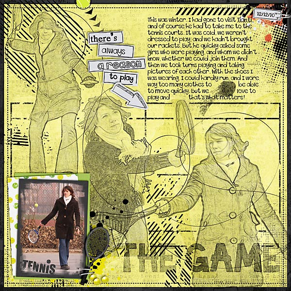
Who says you can only scrap the traditional way (if there is such a thing as “traditional” in digital scrapbooking)? Or with the trend of art journaling lately, pages tend to get all artsy and messy. Today, however, I would like to talk to you about a very different style of scrapbooking: magazine style.
If you look at a magazine, you would probably notice certain key features that are typical for this kind of media:
- lots of text (comparatively, though you could argue that it depends on the magazine, I grant you that),
- little to no shadowing of pictures and elements,
- and title work that catches the eye.
If we transfer that onto a scrapbooking layout, there would be three things you would really have to focus on: the photos, the text, and your title work. (Clustering lots of elements – doesn’t really work well for this, sorry for all of you who – like me – love to pile things onto their pages.)
So, how does this really work on a scrapbooking page?
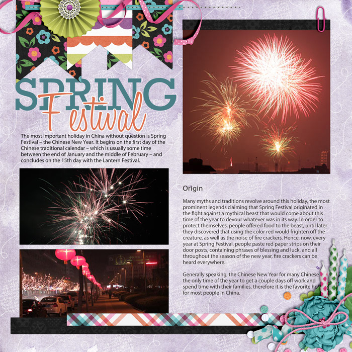
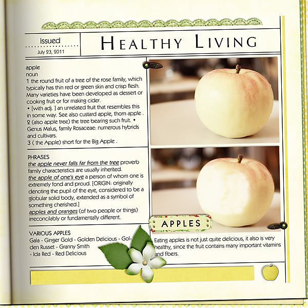
Well, today, I have a couple of examples for you from my gallery.
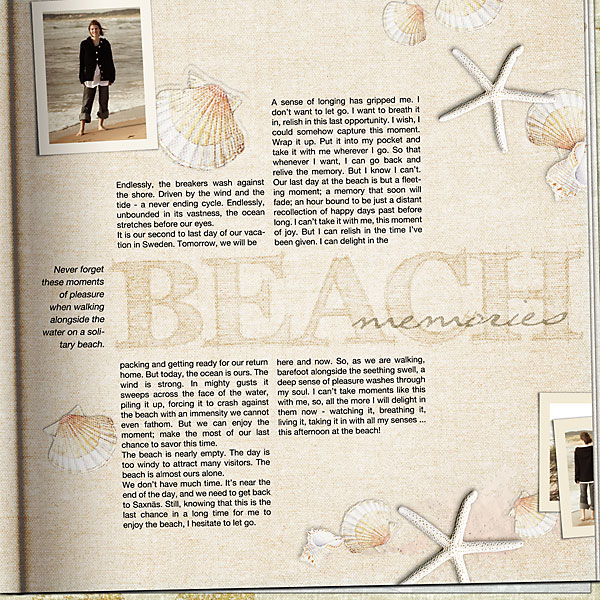
And of course, things can get a bit artsy, too.
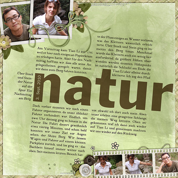
Or even more artsy/messy:
As you can see, there are basically no limits to what you can do with magazine style pages.
Tip:
Scrapping magazine style works well for you, if you have a story to tell, if you want to focus on your photos and the title.

