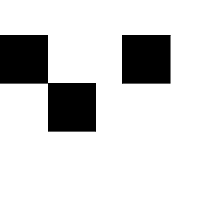
Since (digital) scrapbooking is no less than another form of graphic design, I thought that once a month I’d start to share some insight into the principles and rules of graphic design. Lots of things can be learned in this area, and I’m sure that knowing a little about these rules and principles will help us create even better pages in the future. Now, keep in mind, I’m no artistic pro. All I know about this is self-taught with a few tips by professionals here and there, and I’m making no claim that what I have to say is exhaustive by any means. My goal is simply to share some insights with the hope that it will help us become better scrappers. But if you are a pro and have something to add to what I’m going to talk about, feel free to do so.
So, today I want to talk about a very basic principle of composition – the principle of static and dynamic composition.
Static Composition
In a nutshell, static composition means that the majority of lines on a page are horizontal or vertical. The theory says that horizontal and vertical lines have a soothing, calm, or tranquil effect on the observer.
Static composition also makes use of symmetry to denote perfection, rule and order.
Dynamic Composition
Dynamic composition on the other hand, uses many diagonal lines. Diagonals are somewhat unsettling, which results in a sense of movement, energy, excitement that generates from a dynamic composition.
Generally speaking …
… using the principle of dynamic composition is preferred when it comes to graphic design, because it can more easily capture our attention. Simply put, a dynamic composition seems interesting, diverse, entertaining. It creates some sort of tension, while a static composition can easily “bore” us, because everything seems predictable and unvaried. Still, both types of composition have their place in graphic design, and if you know how to use them well, they can both become a powerful tool.
How does this principle translate into digital scrapbooking?
It’s very simple: There are various types of scrapbook pages we can create. Some are meant to document a certain event. Others are meant to express our thoughts and emotions at a certain time (either of creating the page, or at the time the memory was made). Some pages are meant to reflect a peaceful, quiet, tranquil state. Other pages are full of energy, movement, change – “dynamic” is the word. So, you can use this principle to underline whichever of the two states you want to express with your page. If you want to share a peaceful, quiet moment, something that represents order, regularity, neatness, use the principle of static composition on your page.
But if you want to document an exciting moment in your life, the mess your child has made when creating his first piece of art, the fun everyone had at a birthday party, anything that involves movement, liveliness, enthusiasm, utilize the principle of dynamic composition on your layout.
Using this principle of static and dynamic composition will emphasize your point and help you tell your layout’s story.
Tip:
Since dynamic composition usually is more interesting for the observer, you can easily turn a static composition into a dynamic page by tilting your composition a bit – a slight angle may be all you need to make your page a little more interesting. (In the layers panel, simply select the layers of all the elements/papers you want to tilt on your page, press the windows-logo+t keys on your keyboard [command+t key with mac], change the angle and hit ‘enter’.)


Hey there, i am having a project for my uni in a design course. My professor wants us to present those two words with squares on a board, but he wants them to be on the grid which means straight and not tilted. Do you have an idea how can i do that?
That is an interesting request. Sorry, I was absent from mistyhilltops for quite a while. Life got the better of me. I’m sure you don’t need this anymore. Sorry, I didn’t see this in time to help.