When it comes to traditional scrapbooking, many things seem to fall into place just naturally, while with digital scrapping nothing is coincidence. Everything that is on the page is there, because we deliberately placed it there. For example, while on a traditional scrapbook page you can randomly scatter elements by just throwing them on the page and adhere them wherever they fall, you can’t just “throw” things onto your computer screen, and hope they’ll stick with your digital page. It just doesn’t work that way.
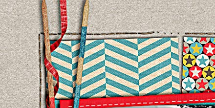
Another thing, that comes rather easily on a traditional page is the looping of elements, for example through a ribbon. You just tie the ribbon around the element, and place it on your page. Not so with a digital ribbon. Wrapping a digital ribbon takes some extra effort and knowledge of your graphics program to achieve the desired look. But no need to worry – it actually isn’t all that difficult. Let’s take a look at this page, for example:
If you take a closer look, you will see that the red ribbon towards the left side of the cluster is wrapped around the two pick-up sticks.
Now, there are several ways how you can accomplish this, and today, I’m going to show you one very simple technique.
Here is how it works …
First, you place everything on your page, just the way you’d like to. Now, depending on where on the page and how you place your elements, you have to decide the order of the layering of the elements you want to use for the looping. On the layout I’m using today, for example I had two pick-up sticks that I wanted to loop through the ribbon. I placed the blue stick at the bottom, the next layer was the ribbon, and I put the red stick on top. (But you could change the order, and that would work, too, if you modify the next couple of steps accordingly.)
Next, I selected the ribbon (marching ants): simply pick the ribbon layer, choose the magic wand tool (in photoshop) and click anywhere on your layout (except the ribbon itself). This will select everything but the ribbon, so you invert the selection by using the shortcut command “win+shift+” on your computer keyboard.
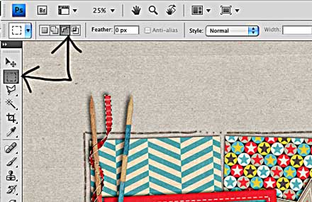
Now, your ribbon is selected and you have to decide, where you want to loop your element. If you are using a curled ribbon as I did on this page, you might want to check where exactly is the lower part of the loop. Those, you’ll keep selected, while you reduce your selection everywhere else: Press “m” on your keyboard, which will choose your “Rectangular Marquee Tool.” Make sure you also choose the “Subtract from Selection” feature (left top corner of your Photoshop screen).
 Carefully erase the areas you want to keep unchanged. In my case, I wanted only the areas of the red stick which should be behind the red ribbon to be modified. So, I erased all the other parts of the selection using the subtraction mode of the rectangular marquee tool. You can see that after finishing this process, there are only two areas left, where the ribbon remained selected:
 When you do this with your project, though, make sure you modify your selection in all areas that are affected. (There was another part further down where the ribbon and red stick interfered, and I had to modify my selections there, too.)
Before you move on, now, first check to make sure that your correct layer is selected (in the layers panel). In my case, it should be the “red stick” layer. Then hit delete. Voila! The element appears to be looped.
How to Add Shadows
Now, one last part needs to be done – the shadowing. You can see, that I had already shadowed my elements earlier. However, since the red stick is layered on top of the red ribbon, the shadows of the ribbon will not show where it appears to be on top of the stick. Also, the shadow is wide and soft behind the ribbon causing it to appear a little more “floating” on the page. But where the ribbon comes over the stick, it should be smaller and harder, appearing closer. How do I deal with this problem? It’s actually very simple.
First, I put the current shadow (wide/soft) on its own layer: In the layer panel, select the appropriate layer (in my case the ribbon layer). With your mouse, hover over the part of the layer where it says “Drop Shadow”, and right click on that part. A menu will pop up, and towards the bottom you can find the command “Create Layer.”
 Now, that the shadow is on its own layer, go ahead, and add another drop shadow – in my case a very small, hard one (I used the drop shadow style which I usually use for papers – for this ribbon it’s the right choice). That new shadow style you put on its own layer, too, because this is the one you want to modify.
With the latter shadow layer selected, I press “m” to use the rectangular marquee tool again (make sure you have switch your marquee tool from “subtract” mode to “new selection” mode, in the upper left corner of your screen). Carefully select the areas of the layer where you don’t need the shadow to be seen (basically anything that doesn’t “touch” the stick). Delete.
 Repeat as required, and follow the same steps with any other element you want to have looped through your ribbon. That’s it.
Now you have a realistic looking element cluster, that will give your page a little something extra to stand out in the galleries!


