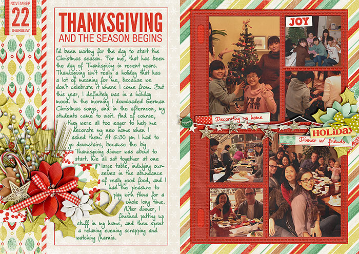
Like every year around this time, all the talk is about the December Daily project. So, for today’s tutorial post I’d like to take you behind the scenes of my own DD project this year, sharing some of my thoughts and processes.
Last Year
If you have looked at my DD album from last year, you will have noticed that all my pages were based on the same foundation page: photos on the left (stuck into photo pockets), journaling on the right side with two clusters of embellishments, the title, and the date info.
I had created myself a foundation page template which helped me jump start each page quickly, and without having to spend much thought on composition, choice of papers, and placement, scrapping each page was a breeze. Even now, one year later, I still love how my pages turned out, and when I first started thinking about this year’s DD project, I was seriously tempted to just use the same template and format again. The thought of having two very similar albums, however, made me hesitate (despite knowing of the advantages it would bring to scrap with a ready-to-go foundation page, which would prevent this project from turning into a stressful catch-up race). So, this year I decided to take a different (albeit a little more laborious) route.
DD Twenty-Twelve
This year, I’ve started to mix things up a bit. If you look at Saturday’s first weekly recap, you may notice that I alter the sides where I place my journaling and photos each day. I still try to keep the format of titling and journaling the same by using the same fonts and title composition on each layout, but I’m also alternating the layouts of each journaling page.
The reason for that is that I really wanted to use a little more papers this year than I had last. The downside to this is that I usually spend a good amount of time browsing through template folders and internet inspiration to find a composition that I like well enough for that day. So, creating a page really does take almost twice as long this year, compared to last’s.
I still love to use photo pockets, however, and over this past year I was able to pick up a couple more sets of photo pockets, so that I have more to choose from this year.
What Helps Me This Year
1. Inspiration from Other DD Projects
I’ve searched the internet and created a DD board at pinterest, where I can easily get new inspiration.
Good places to search for DD inspiration would be pinterest, the galleries at twopeasinabucket.com and scrapbook.com, as well as google images, of course.
2. Inspiration from Templates & Albums
Last Wednesday I shared a couple of DD products with you that I have been using, either as inspiration, or I have these in my scrap stash. For example, this past spring I won Sarah Gleason’s Pear Tree template album, and use a lot of materials from that, but often alternate her templates to suit my needs.
3. A Wide Range of Photo Pockets
I mainly use Traci Reed’s and Valorie Wibben’s Photo Pocket products (both of them have a wide range of sets in their stores). So, I don’t have to think much about composition on the photo side of the page.
4. Word Art by Various Template Designers
Cindy Schneider is one template designer who releases awesome sets of word art that only need to be recolored and look good on any layout. One thing I didn’t mention in last Wednesday’s post but should have was her layered date sets (of which she has a ton in her store). They are very easy to modify (or can be taken as is) and are a great way to serve as dates/day numbers.
That’s it from me now, but stay tuned, because next week I’m planning to talk about how to give your papers, photos and embellies a frosted look, perfect for any wintery kind of page (and your digital DD, of course).


