I love drawing inspiration from templates. See, the good thing about templates is that they are so versatile. You don’t have to work with a template just once and then it’s kind of an old shoe. It’s not. Working on the creative team of a template designer (Cindy Schneider), I’m always amazed to see all the different ways my other team colleagues are using the same templates. The sky is the limit. So, in other words I’m saying: use your templates more than once to take full advantage of them.
6 Ways of Re-using Templates
Option #1 | Flipping & Rotating
Obviously, the easiest way to re-use a template is by flipping or rotating it. When you do that, you’ll be amazed at how differently the page will look, and unless someone studies the two layouts in question very hard, no one will be able to tell that you’ve used the same template twice.
[border ]
Option #2 | Using Different Kits, Topics, Events
Another way of making sure no one realizes you’ve used a template again, is by simply using another kit, topic, or scrap about a different event (most likely you’ll do all of that).
[border ]
Option #3 | Adding Extra Element Clusters or Papers
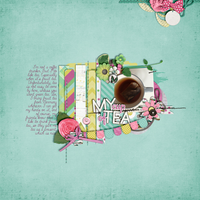
You can further disguise the fact that you are re-using a template, by placing additional clusters on your layout. Or add another couple of layers of papers etc.

|

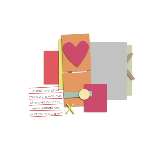
The original template from Sarah Gleason’s “Ambrosia Template Album” which I used for the layout above.
[border ]
Option #4 | Combining Templates
The next option is to actually combine two templates to make one. The effect can be interesting and really fun!

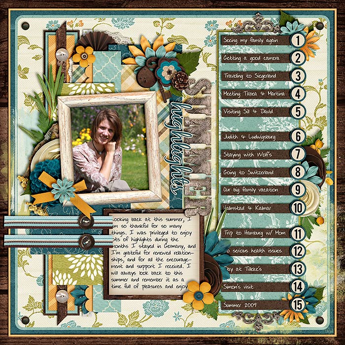
On this layout, I combined two of Cindy’s templates (one with a list, and one with a simple cluster) for a stunning effect.
[border ]
Option #5 | Removing Elements
What about removing elements, paper layers and clusters to simplify your template and give it another, different look?
[border ]
Option#6 | Changing Placement of Clusters, Title, Journaling etc.
And lastly, you can change the positions of clusters, the title, or your journaling. Put these in a different corner of your layout, switch out the sides where to place your title. Place your main cluster off-center.
Play around with your options to see what you can do to make the most of the templates in your stash.


