Latest Posts

30 Days of Thanks (9)

Today, I’m thankful for the sunshine, and having a fun time with my friends at lunch. I’m also thankful for being able to get together with a friend this afternoon to play with our cameras, and for the season of fall.

PS. And I’m thankful that it’s only 5 more days until the heat will be turned on.

Behind the Scenes: Principles of Design – Creating Active Space

It’s been a long while since I talked about principles of design the last time. So, today I want to discuss something that I’ve meant to share for a long time, and that is the Composition Principle of Active Space. Generally speaking, this rule applies to composition in photography and art, but today I’ll show you how it is useful to know about this principle in scrapbooking as well.

What Do I Mean With “Active Space?”

Active space is the space “in front” of the person/object; the space a person/object is moving or looking towards.

When you look at a photography, your eye usually will be lead through the image. If the composition is bad, your eye doesn’t actually know where to look, or what exactly to focus on, but if you have some understanding of composition, you can determine where you want the observer to look first, and how you want their eyes to move over your picture. This is where the principle of active space becomes important.

Example
If the subject in your image is moving, naturally, the eye will move in the same direction as the subject. So, when you’re taking a picture, if at all possible you would want to make sure that the space in front of a person is larger than the space behind the subject. This creates active space. Take a look at this example:

When you look at this picture, your eyes probably will start with the two soccer players, and then move in the same directions as the two people running. This creates a sense of drama and anticipation in this shot.

Now, take a look of this photo:

Here, the eye doesn’t really know where to focus, and the movement away from the frame of the picture creates an imbalance, and a restlessness that causes the observer to quickly lose interest in this picture. The result: A bad photo! (Don’t worry, I took the pictures myself earlier this year during a soccer tournament at our university, so I’m criticizing my own work, lol!)

Now, the same principle applies to portrait photography. When you take a picture of a person, make sure that the person looks “into” the picture, not outside the frame. Otherwise the observer always keeps wondering: What are they looking at? What am I missing from this picture? In other words, if a person is looking in one direction, make sure you place them on the opposite side of the frame, so you give them space to look into. Again, this creates a balance, and allows the eye of the observer to flow and move along your composition.

How Does This Apply to Scrapbooking?

When it comes to scrapbooking, knowing about this principle can really help you improve your layouts. Basically, it comes down to this: When you place a photo, make sure you place it so that the direction the people are looking in, is inside the frame of your layout, not away from your layout. For example, using the picture of my friend above, you wouldn’t want to place that photo on the left side of your layout. Placing it there would mean that he is kind of looking away from what you’re creating, drawing attention to what’s outside the page frame, and therefore away from your page. And that’s exactly what you don’t want. Instead, it would be best to place the photo anywhere towards the right of your page. Thus, he will look in the direction of your page, drawing attention to whatever you’ve put together on your page.

If you’d place the above photo in the center or your page, then it would be good to make sure that whatever is most important to you on the page is placed right in the direction where the subject is looking toward, for example with the image above, to place important embellishments etc. toward the left bottom side of the photo. This creates balance, and your eye would flow naturally over the layout.

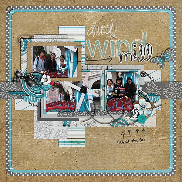
Here are some example layouts:

And here’s one bad example:

When putting this page together, I knew right away that it would be bad for the composition to have the people look away from the page, but I just hated mirroring the photos as well.

After having said all this, one last thing I want to point out: Design rules are meant to be broken, and it doesn’t mean that from now on you have to follow this principle on every single layout. My galleries are full of pages, where I didn’t apply this rule, and the pages still turned out well.

Survival with the Bike Bell

It used to be a lot better looking. And it even used to have a compass on top – before the compass decided to have a divorce (and it never even asked for my permission – ungrateful thing!). Now it’s just a simple, compassless bike bell. But it’s a good one. And I need it. Almost as desperately as I need the breaks on my bike. Because without my bike bell, trying to get to class with my bike would be an almost hopeless case. There are just too many students on the road when I’m on my way to class. And even with the bell it’s quite the challenge to weave through the crowds of students. So, my bike bell turns out to be a life-saver, both for myself, and for any student that would inadvertently run into my bike if it wasn’t for the bell. What a lucky thing to have that bell. Even if it’s a divorced, compassless bell!

Saying Thanks …

And, since we’re talking about bikes and bells already today, I’m really thankful for my bike, and that it helps me get to class a little faster. And for the bell, of course, that helps me survive riding my bike.

I’m also thankful today for passing the little campus garden that just looks wonderfully like autumn these days. Need a proof? Here you go …

PS. And I’m thankful that it’s only six more days until the heat will be turned on!

Why Showering Takes Twice As Long These Days

Culture week is over, and I’m sure most of us are very relieved – despite of all the fun it brings. Now, we can focus back on the simple things of life. Like taking a shower.

If you remember, just a couple of weeks ago, I posted about my hot water heater, and how it makes me really happy. And that’s exactly the reason why showering takes me twice as long these days. Well, or at least it’s half the reason. Next to making me really happy, my hot water heater also has another big bonus: It makes me feel warm and cozy each time I shower. After all, our heat hasn’t been turned on yet, and my little Mr. Electric Heater – with all his hard work – just can’t keep up fighting the cold that’s been creeping in from all around. So, I am cold; my apartment is cold; outside it’s cold – only my water heater is really, really hot! And that’s why I love spending all that time with my shower and my water heater these days. Because, don’t you know: There’s nothing worse than having to finish a nice and pleasant shower – only to step out into the cruel and merciless cold! At least that’s what I think. So, every morning when I shower, I try to linger and put off that step into cold reality for as long as possible; and for now, me and water heater are best friends. So now you know exactly why showering is taking me twice as long these days.

Saying Thanks …

Today I’m very thankful that my classroom was really nice, and almost cozy, and warm – even despite the fact that it’s in the far north of the campus …

… or that it’s on the first floor …

… or that it’s doors are always open (since they won’t stay shut) …

… or that its open doors lead directly outside where it’s cold.

PS. And I’m thankful that it’s only going to be one more week until the heat is turned on.

Journaling Café: Autumn

DSD is over, and I hope you had a lot of fun shopping and scrapping this weekend. With all the DSD craziness, I decided to take a break yesterday, but today I’m back, and with some exciting news for you, too – at least I hope you’ll think so!

I decided to make another slight change to my Digiscrap Corner. Don’t worry, it’ll be for your benefit. In the past, I’ve posted journaling prompts every once in a while in my “Enable Me/Inspire Me” section on Wednesdays. But I also have lots of other goodies and inspiration to share with you on Wednesdays, so most of the time, the journaling part kinda comes too short. So, I decided to shift things a bit, and turn the Monday Highlight into a Journaling Café. How’s that for a change? In other words, from now on every Monday I’ll post new journaling prompts to inspire you. Now, I’m hoping for your participation, too, and that you’ll link us up and share the pages you create with these prompts by posting a comment with a link to your finished layouts. Does that sound like fun? Well, then here’s my first prompt:

Autumn Journaling Ideas

In many parts of the world, autumn is in full swing, which means leaves are changing their colors, everyone is getting ready for winter, hot chocolate and warm wishes. What are you doing to make this fall special and memorable?

I hope you’ll enjoy your journaling with these prompts this week, and don’t forget to come back and post your pages here!

The font used here is my own handwriting font DJB Squirrels In My Pants by Darcy Baldwin (available at the Sweetshoppe).