Latest Posts

Freebie Friday: Winter

Comes in a layered psd file. Simply click on the image to download.

It’s happy hour in my little scrap corner again, and today, I got you this quite elaborate template. It’s based on my page “Winter Wishes.” Make sure you pick it up, before the link expires, and I hope you’ll have fun with this template. Also, if you’ve missed last week’s template, you can still download it as well. As always, I’m quite curious to see what you guys create with these templates, and I’m always happy, if you link us up with your finished pages.

That’s it from me today. Happy Friday, scrappers!

Note:
Please do not re-distribute this template in any way (you may share the link to this post), and when you use this template, please make sure to credit it to Misty Hilltops Designs.

Hybrid Hub: Card No. 26

I’ve got another card I want to share with you today. It’s made with the kit “Animal Crackers” by Libby Pritchett and Tracey Howard, and I wish I had a way to properly translate the German sentiment, which means “extremely good” (a common expression in German), but the literal translation is “animalistically good” or something along those lines, though that really doesn’t mean anything in English, lol. Anyways, for the sentiment I used one of Darcy Baldwin’s fonts.

Enable Me: Words To Inspire Part 1: A-I

We scrappers are always looking for ideas and inspiration to spark our pages. One thing, a lot of us are struggling with is finding the right words for titles or topics, so I actually compiled a list of useful, inspirational words that would make great titles on any page. And today, I’m presenting the first part of this list:

I hope these words will help you find a title for a page, sooner or later, and of course, stay tuned to get the second part as well!

Behind the Scenes: Enhancing Legibility of Your Journaling on Patterned Papers – Part 2.

When working with journaling on patterned papers, one of the things I like to do is adding a slight brush layer, as I recommended in the first part of this tutorial. So, today, I’m going to show you how to do just that:

Adding a Brush Layer to Enhance Journaling

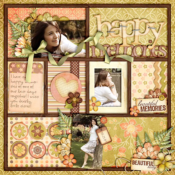
Take a look at this page:

On a slightly striped paper, I wanted to add some journaling. But after I added it, I realized the striped pattern was just to strong -the journaling lost its focus. So, if you look more carefully, you can see how behind the journaling, the stripes are nearly wiped out, and I did it by adding a brush layer.

And here’s how it works …

(I’m assuming that you already added your journaling to your page, and that you placed it somewhere on top of a patterned background.)


STEP 1 | Add a Layer Above Your Patterned Paper
To avoid messing with your patterned paper, simply select that paper layer in your Layers Panel, and add a new layer right above it (windows key + shift + N).


STEP 2 | Add a Brush
Press the key B to select the Brush Tool, and from your Brushes Menu select a large soft brush. (I prefer to use the spatter brushes that came by default with my Photoshop program for a more subtle effect). Now, making sure your new layer is still selected, begin to click several times on the area where you want to blend out a little of the patterned background. (Don’t stroke, just add the brush with single clicks, and you don’t have to rigorous by making sure everything underneath is completely covered. Allow the pattern to still show through a little.) Especially toward the edges of your journaling you may want to make sure that your brush layer will sort of softly fade into the patterned background paper, otherwise the change will be too abrupt.

Tip #1:
Play a little with the opacity settings of your brush tool for a slightly more subtle approach. The goal is not to completely wipe out the patterned background, but to subdue the tones so that your journaling becomes legible.

Tip #2:
Make sure with your Eyedropper Tool (I), you choose the color that is most prominent in your background pattern.


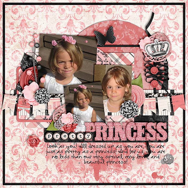
Here’s another one of my layouts using this technique for enhancing my journaling on patterned paper.

This is basically it. You can still play with the opacity levels of your brush lever (in the Layers Panel), but other than that, your journaling should be nice and visible, while you still can show off that beautiful patterned paper you chose!

You can find part 1 of this tutorial HERE.

Journaling Café: Winter Thoughts

For many of us in the northern hemisphere, winter’s still somewhat in full swing, and I haven’t even taken the time to look at some wintery-themed journaling. But today is the day where I make good that neglect! Here are some prompts to help you put your thoughts about winter to paper:

And here’s one of my pages:


The font used here is my own handwriting font DJB Squirrels In My Pants by Darcy Baldwin (available at the Sweetshoppe).

Treasure Sunday: February 19th

Here’s more inspiration with all the gems that I found in the galleries this week. Let’s start with this little beauty here:

Beautiful by twinsmomflor
What a great artistic approach to a digiscrap page! The blending of backgrounds, elements/brushes and the large photo is stunning, and I love the little elements she added to give this page a more three-dimensional feel.


Memories Live Here by wombat146
Next up is this gorgeous gem, which has a great composition and such a lovely mixture of elements and papers. And I love how the shadowing of that string looks so realistic!


Traffic Jam by Mama_Maike
Great blocking of papers, photos and elements mark this layout, and I love the fresh colors on the white background.

The Sign by oldvwblues
Staying a little longer on the topic of traffic: I just had to laugh when I read the sign. But actually, it was the fun composition, and the lifted corners of the pictures that caught my eye.


Totally Sweet by iciclelady
Last but not least I got this page today, which I kept coming back to. I love the double column of journaling, on which she placed her photo and elements, and the little scattered element clusters make the perfect addition to this page.

Well, I hope you enjoyed today’s picks just as much as I did, and have a great week!

P2D: The Jump

I got another paper-2-digi sample for you. Recently, I found this page in the galleries, which I happened to find a fun page:

So, I took the inspiration, and turned it into this digital layout:

Are you getting inspired? The you should go and find yourself a page to play with.

Today is the day …

Today is the day when for the first time this winter I could go and play tennis without a scarf since it was nice and sunny outside.
Today is the day when for the first time this winter I was overrun by people and balls at the tennis court – yes, the students are back! (But I also get to have someone to play with, which is fun!)
Today is the day when the streets on campus are filled with students again, and most of the stores are open.
Today is the day when the supermarket downstairs has piles of toilet paper set up in front of the entrance – yes, the students need to stock up on necessities.
Today is the day when I decided that I’ll go and get a meal in one of the student cafeteria some time soon, and treat myself to a cup of caramel milk tea.

Today is the day when I’m glad that life is back to normal again.

scrapbook layout, girl

Pretty Princess

Credits:
C’est Jolie by Traci Reed & Krystal Hartley
Template: Set 115 by Cindy Schneider
Font: DJB I Am That Girl


Precious

Credits:
Splendid by Kristin Cronin-Barrow
Template: Single 15 by Cindy Schneider
Font: DJB I Am That Girl by Darcy Baldwin