All posts tagged: behind the scenes

Behind the Scenes: How to Create Custom Shaped Text Paths

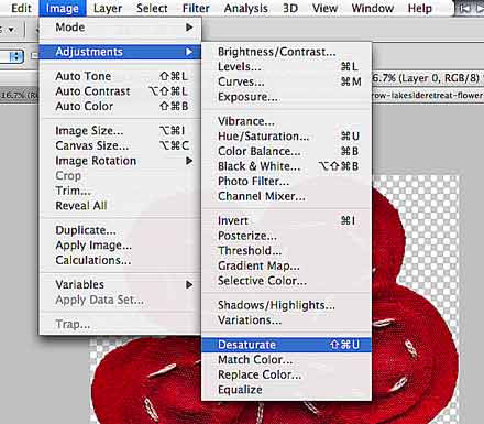
If you’ve seen my recent posts, you’ve probably stumbled across my December Daily pages. If you took the time to look at one or two, you might have noticed how the journaling wraps neatly around all the embellishments without really interfering with them. Today, I’m going to show you how to create such a text path that is customized to wrap around your elements and clusters. (This is useful not only for December Daily projects, but for any layout that requires a custom shaped text field.)   In this tutorial you will learn how to … …  make a customized selection (based on your element and text layers); … contract your selection; and … turn your selection into a text path.   Here’s How It Works …   STEP 1 | Duplicate and Merge Layers Assuming that you’ve already put together your layout, including all the embellishments and element clusters you have wanted to add, go with your cursor to the layers panel, and select all the layers that you want your text to wrap …

Behind the Scenes: Turning Text Into An Outline

Did you ever wonder how to turn text into an outline? Well, I have the answer for you, in this new quick and easy tutorial. The Background Story (you can skip this part, if you’re only interested in the tutorial) I’ve started working on my December Daily project for this year, and I decided to go with the inspiration by Ali Edwards. She created a set of 6×8 overlays to use as foundation pages. I really like that style for my own album this year. The only problem: The size. Living outside the US, we just don’t have letter sized paper, and for printing purposes it would be really impractical for me to use her set of overlays. So I decided to create my own overlays – quite similar to hers (I only added a month field to the date corner, because my project already starts in November). Looking at Ali’s set, I really love how the letters overlap, and simply rasterizing the type doesn’t do the trick to retain that overlapping. So I had …

Behind the Scenes: Principles of Design – Creating Active Space

It’s been a long while since I talked about principles of design the last time. So, today I want to discuss something that I’ve meant to share for a long time, and that is the Composition Principle of Active Space. Generally speaking, this rule applies to composition in photography and art, but today I’ll show you how it is useful to know about this principle in scrapbooking as well. What Do I Mean With “Active Space?” Active space is the space “in front” of the person/object; the space a person/object is moving or looking towards. When you look at a photography, your eye usually will be lead through the image. If the composition is bad, your eye doesn’t actually know where to look, or what exactly to focus on, but if you have some understanding of composition, you can determine where you want the observer to look first, and how you want their eyes to move over your picture. This is where the principle of active space becomes important. Example If the subject in your …

Behind the Scenes: Creating Ribbons from Patterned Papers

I have another really simple and quick tutorial for you today. When working on one of my CT pages for Libby the other day, I really wanted to use another one of those pretty papers she and Meghan had put together in their new release “Fullness of Life,” but I already had lots of papers in use, and couldn’t find how to add another one without messing up the entire page. Then a light went off! Using a template, there was still one ribbon that needed to be replaced, and I thought: Why not use that patterned paper for that ribbon? But I still wanted to make it look realistic, and really like a ribbon. Well, I thought, that’s easy peasy, just clip and apply a blending mode and that’ll do the trick. Here, take a look at my finished page: See that ribbon with the hearts behind the photo? This is what we are going to recreate today. In this tutorial you will learn how to … … clip a paper to a ribbon …

Behind the Scenes: Creating Journal Mats from Custom Shapes

The other day, I created a layout on which I used a leaf for my journaling, and after uploading it to the gallery, I got several comments because of that, so I thought, today I’d show you how to create a journal mat just like that, using custom shapes and working with a text path. Anyways, I haven’t done a tutorial in so long, it’s really time for something new … In this tutorial you will learn how  to … … create a custom shape and clip a paper to it; … ink the edges for a more worn look; … create a text path from a custom shape and fill it with your journaling; … add a border to your shape. Here is how it works … Step 1: Create a Custom Shape On your canvas, go to “Custom Shapes” (U), choose a shape, and holding down the shift key, create a proportional shape. Step 2: Rasterize Shape Rasterize the shape.   Step 3: Create an Expanded Selection With the Magic Wand Tool (W), …

Behind the Scenes: Making Fonts Look Real

I’m excited, because today I’m going to show you one of my favorite techniques in digi-scrapping. I use it on almost every single page I create, and even though the title says that it’s related to fonts, you really can use it for everything – photos, brushes, stamps, rub-ons; everything that you put directly on a textured paper and want the texture to show through. The Example Let me give you an example: You’re writing something on a paper background, but that background has wrinkles and folds. Simply placing your text on top of that will make your journaling look unnatural, and as if the font is kind of floating. That’s what you do not want to happen! Take a look at this page that I created back in April: It has some journaling on some pretty wrinkled/folded paper. Now, let’s take a closer look at the journaling:   This is what the journaling would look like, if I don’t make any adjustments to the text. The letters simply ignore the folds, which makes everything …

Behind the Scenes: Recoloring Gray-Scale Items

Today, I have a very simple tutorial on how to recolor gray-scale items. This technique works best for papers and elements that only have different shades of the same color, or at the most have some white mixed in. Here’s how it works … Step 1: Duplicate Open your element that you want to recolor. Unicolored flowers, etc. are perfect for this. Make sure you duplicate your image (never work with your original, if you want to avoid ruining it by accident): Simply go to “Image” and then “Duplicate.” Step 2: Desaturate The next thing you need to do is desaturate your image: Go to “Image” again, and then “Desaturate.” You see, I am working with a red flower that has some white stitches. (The white stitches are just border-line to work well with this technique as you can see with the end result.) Anyhow, now you are ready to change the color. Step 3: Create New Layer & Fill with Color Create a new layer (windows key + shift+ N), and from your layout …

Behind the Scenes: Creating Scalloped Mats

Of course, there are lots of free templates that offer scalloped mats, and lots of digiscrap kits come with scalloped mats for journaling, etc. Sometimes, however, you just need to create your own in order to meet your needs. Or searching for those shapes to use them for clipping masks can take up a lot of time, to. Today, therefore, I’m going to share how very simply and with little effort you can create your own scalloped mats. I’ll create a round mat, but you can do any other shape as well. Here’s how it works: Step 1: Create a Path If you are working on a layout already, simply add a new layer (windows key + shift + N) to your canvas (or open a new canvas and add a new layer. Choose the shape tool (I picked the Ellipse Tool for the round shape), and make sure you select the path option (at the top right of your photoshop screen).           Holding the shift key, draw a circle. Step …

Behind the Scenes: Creating Word Strips

Most digiscrap kits come with little word strips and pieces of word art. I don’t know about you, but I rarely find myself using those word bits, because either they don’t say what I’d like to say, or they just don’t match with the topic of the page. For me, being somewhat international ( 😉 ), living in a somewhat tri-lingual world of English, Chinese, and German, I run into another problem with these ready-made word strips – they usually all come in English, and if I’m creating a page in German (which happens a lot for photo book projects etc.) then it’s just not right to use English word strips. Having said that, I have to admit, I like to use bits and pieces of word art on my pages. And the solution to the language/topic dilemma is: Creating my own word bits. Of course, the best thing is, if the designers are considerate enough to add blank versions of their word strip pieces to the kit (I end up using those a lot). …

Behind the Scenes: Inked Edges

Have you ever looked at those shabby vintage style products and wondered how you could get your page to look a little more shabby? I certainly have. Many times. Especially when I use some background paper to clip to a strip for a label or journaling strip, and the result just doesn’t look shabby at all. But then I found a super easy way to actually get that shabby look, and all it takes is just a few steps in photoshop. Take a look at this page: There are several places where I clipped papers to a shape, and without inking the edges the result would look something like this: Then I inked the edges, and this is how that turned out: Pay attention to the edges … So, if you would like to know how to get that effect, here’s the deal: Inked Edges Step 1: In the layers panel, select the layer of the paper/photo/element you want to modify. Double click the layer in the panel to open up the Layer Style dialogue …