Have you ever heard about tracking and kerning? If not, today you will, for it is “Time for Type!” Yes, you got it right: today, we are talking about fonts again. Fonts and journaling. If you know anything about typography (or graphic design for that matter), you might have heard about tracking and kerning already. For those of you who are clueless, however, let me explain …
Tracking – according to one of the many photoshop tutorials – is “the process of loosening or tightening the spacing between characters” in a text.
Kerning is “the process of adding or subtracting space between specific pairs of characters.”
If you go “Ah???” now, hold on! I’m still not done explaining.
Tracking
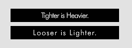
Basically, when we talk about tracking, it means to add or take away space between the characters of your text. It applies to the whole text and can make your text look wider or more dense. Condensed text will appear heavy, while loosened text will appear lighter.
Kerning
Kerning, on the other hand, deals with adjusting the spaces between specific pairs of characters. Every letter (of our alphabet) looks differently. Some are tall, others short. Some are wide, others very narrow. Compare the letters i – m for example. When no kerning is applied, sometimes the spaces between various letters look odd, because basically the same space is given to every letter. This results in gaps between some of the letter pairs, especially between letters whose forms angle outward or frame an open space (W, Y, V, T, L). In other words, the spacing seems irregular with any words that combine one of these letters with another character. To solve this problem, kerning is used. Compare these three lines of typing:

For example:
Take a moment to compare the space between the W and the a in the word walking. The space between this pair in the first line seems to be a lot wider than in the other two lines. It causes the W to appear more separated from the rest of the word, which in typography is a very bad thing! Perfect kerning allows every character of a word to be in perfect (regular/uniform) relationship with each other.
Now, in the image above, you also might have realized that there are two types of kerning. Metric and optical. Metric is another word for automatic. Many fonts already come with some sort of kerning built in for certain (very common) pairs of characters, which already makes the font appear a lot more uniform. Photoshop uses metric kerning by default.
However, if you work with a font that has very minimal to no pre-kerning included, or you are using different typefaces or sizes in the same line of words, optical kerning could solve your problem. According to one photoshop tutorial, “optical kerning adjusts the spacing between adjacent characters based on their shapes.”
For the very professional typographer, manual kerning is, of course, the best. But for us not so professional scrappers, both metric and optical kerning will do. Here is another illustration, using both tracking and kerning.
![]()
Note, how the space between W and a in the last two lines is prominent. However you see it, to the reader of your text, using some kerning will be much more pleasing to the eye than going without kerning.
How To Adjust Kerning & Tracking
![]()
Photoshop has made this especially easy for us. Simply select your the text layer you want to work with (layers panel), open the character panel, and there both kerning and tracking can be easily adjusted.
Why Kerning & Tracking?
After reading this, you might ask, as a simple scrapper who doesn’t care much about graphic design, why is kerning and tracking so important?
Well, for one, if you are using any custom made or handwriting fonts, chances are that some of those fonts don’t have any kerning built in, and the spacing between some of those characters – speaking plainly – looks ugly!
Also, sometimes tracking your fonts can work miracles on your layout. Again, heavier or lighter makes a big difference on a scrapbook page, both for titles and journaling. You want a light, happy kind of page? You want a rather sober, maybe even gloomy kind of page? Try adjusting the tracking and see what happens.
At other times, I find the individual characters are spread out too far, or not enough, which is why I’ve used tracking many times in the past.
And quite honestly, almost every single time I’ve used the optical kerning, I like the look better than with the automatic (metric) kerning photoshop uses by default.
Here are three examples of some journaling without, with metric, and with optical kerning:

No kerning

Metric kerning
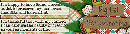
Optical kerning
Note, how there is hardly any difference between metric and no kerning (at least with this font – there will be very obvious differences with other fonts, though). Optical kerning, however, often allows more space for writing than the other two. The word “creation” ended up in one line with the optical kerning, while it was hyphenated with both metric and no kerning.
Tip:
Kerning can be especially useful when working with text paths, and your text doesn’t fit the path (by maybe one or two characters). By applying the optical kerning feature, you might gain a few spaces, which might be all you need to fit your text.
Danke für den Tip, werde ich mal ausprobieren